case study: YOPP Brand Strategy
Buy Now, Pay Later for the GCC market | Lead Product & UX/Branding Designer | 90 days
Context
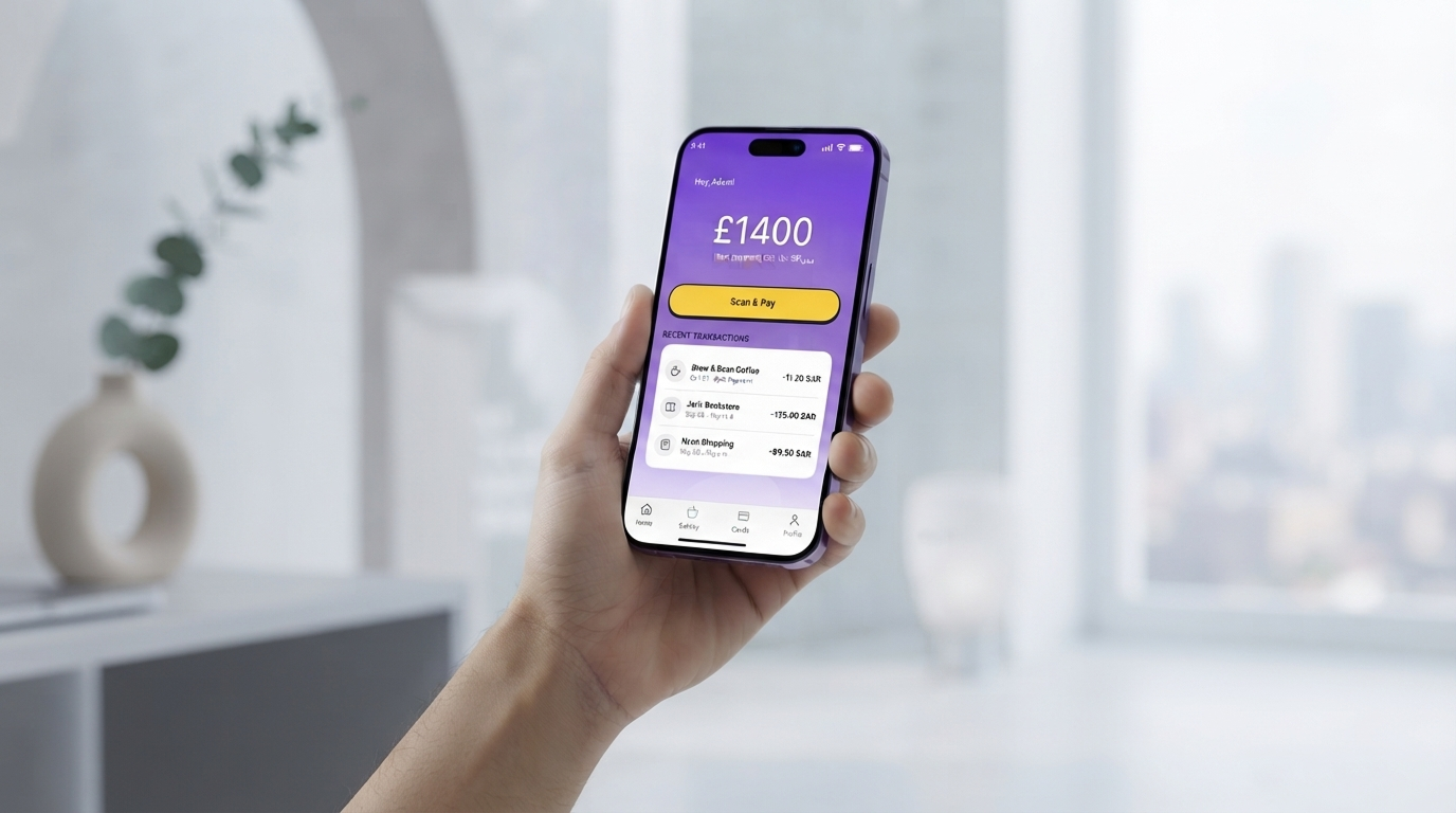
Yopp started as a working MVP with no name, no identity, and no real UX. The goal was to turn it into something a young Saudi user would actually want to use. The fintech space was dominated by either institutional players (traditional banks) or copycats of US BNPL models that didn't account for local regulatory needs (Shariah compliance, KYC via Nafath) or cultural preferences.
The opportunity
Underserved youth market in GCC with high smartphone penetration, strong demand for flexible payment options, and limited digital wallet adoption.
My mandate
Take the MVP and transform it into a market-ready product: design the core UX flows, build a strong visual identity, establish a brand name and positioning, and create a cohesive design system that could scale.
The Situation
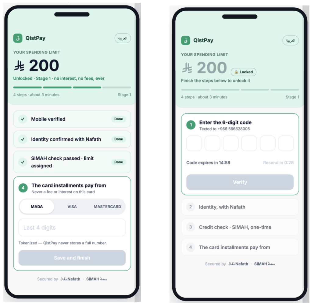
A startup had built a basic MVP for a pocket-money fintech app targeting Gen-Z in Saudi Arabia. The product was functional but entirely un-designed: no branding, no visual identity, no name beyond a placeholder, and minimal UX polish. Engineers had prioritised feature shipping over user experience.
Before: MVP as Built
Basic functionality, generic UI, no brand. The app worked but felt rough and lacked any personality or market positioning.
Before: MVP as Built
Basic functionality, generic UI, no brand. The app worked but felt rough and lacked any personality or market positioning.
Research & Market Strategy
Before designing a single screen, I conducted market research to understand the competitive landscape, identify white space, and validate what would resonate with Gen-Z users in the GCC.
Key Findings
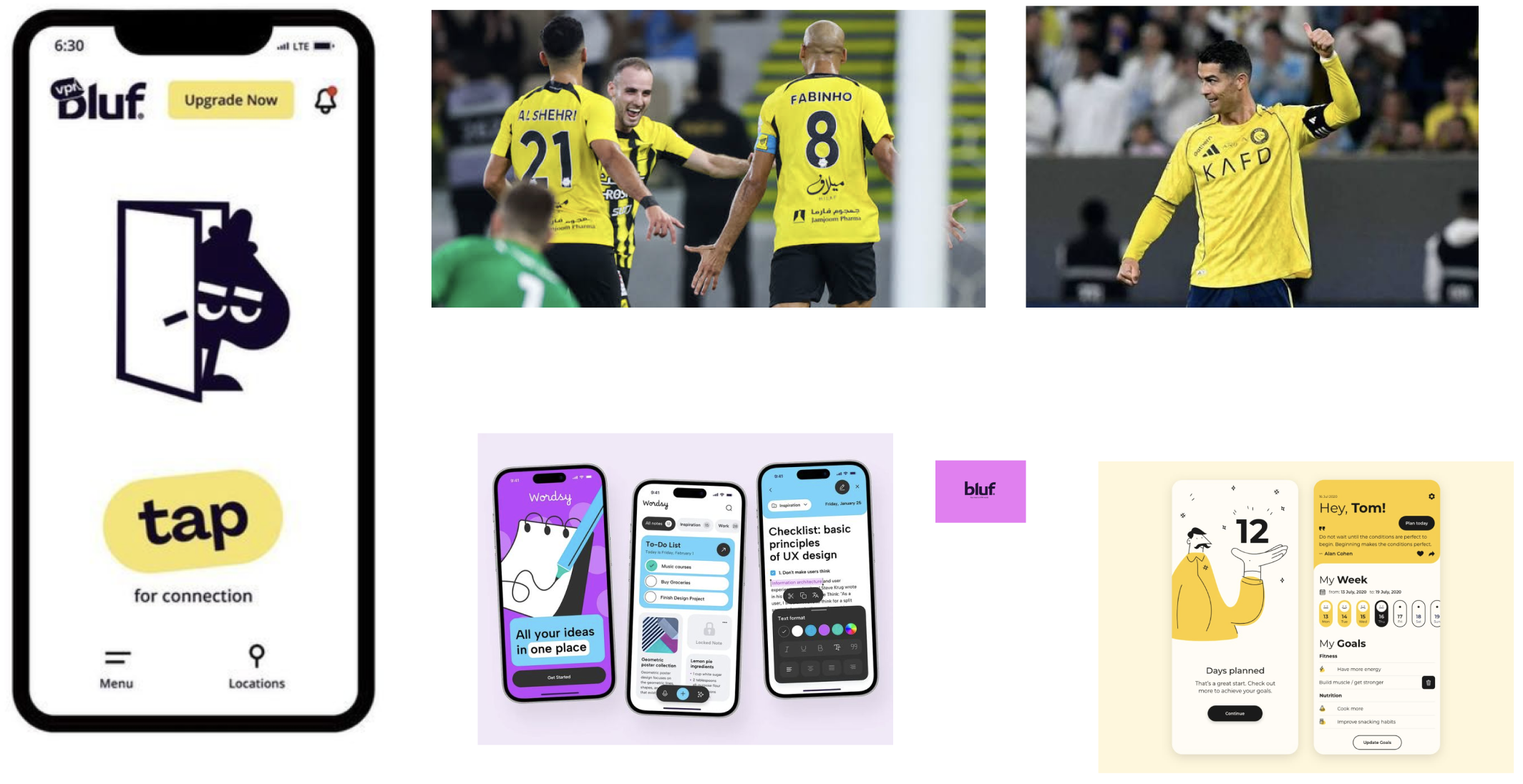
Snapchat is the lingua franca. Saudi Gen-Z lives on Snapchat—it's where they communicate, share, and discover. The design language had to feel fast, playful, and intimate, not corporate. This meant embracing simplicity, movement, and a sense of immediacy.
Yellow owns the emotional space locally. Saudi football teams (Al-Nassr, Al-Hilal) wear yellow with pride. It's a color of victory, energy, and local pride. But every fintech app was copying grey and blue from Silicon Valley. Yellow was underclaimed in fintech but emotionally resonant here—if done right, it could feel local and modern at the same time.
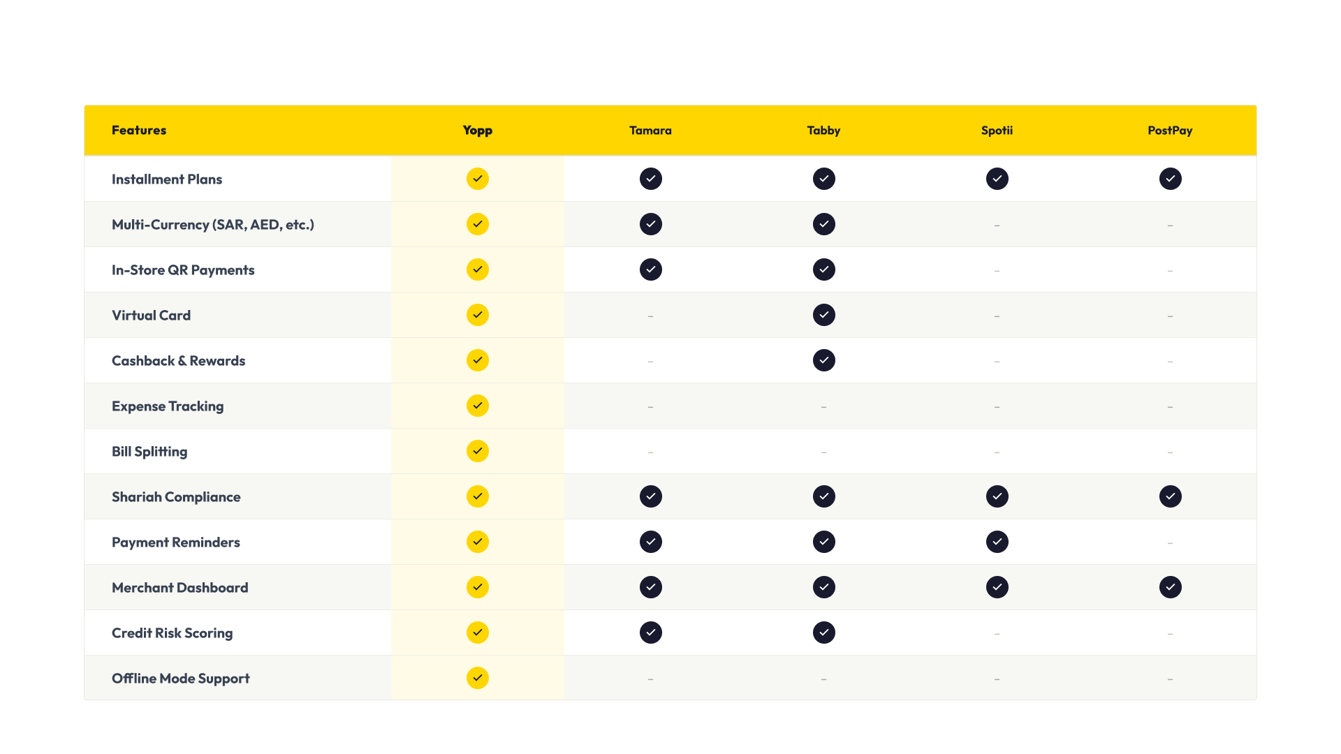
Competitor gap: Established BNPL players focused on big-ticket purchases (appliances, furniture). None owned the small-spend, daily-use case.
Regulatory leverage: Shariah compliance and Nafath integration were barriers for new entrants—an opportunity to build trust early.
Client was brand-obsessed. Unlike typical startup MVPs, this client understood that a strong visual identity and clear brand direction were non-negotiable. They'd seen how design direction (like the Bluf VPN rebrand) could completely reposition a product in the market. They wanted to invest in branding, not skip it.
My Role & Client Partnership
As lead product & UX/branding designer, I owned the entire user-facing transformation. But critically, the client was deeply invested in brand strategy—they understood that design direction, not just execution, would determine market success. This partnership meant we could push bold decisions (like claiming yellow) because both sides saw branding as a competitive differentiator, not a nice-to-have.
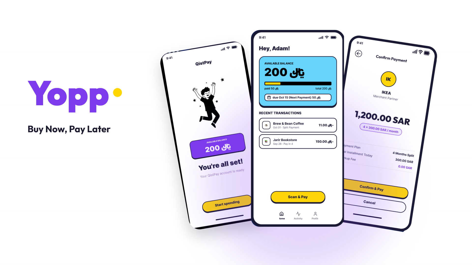
Brand strategy & naming — Positioned Yopp as youth-first, speed-focused, and trustworthy. Chose a name that was memorable, locally friendly, and ownable. We tested names against the Snapchat-native, speed-first positioning.
Product strategy & UX architecture — Mapped core flows (scan & pay, installments, transfers, onboarding) and eliminated feature bloat to focus on core value. Snapchat taught us that speed and simplicity were brand promises, not just design principles.
Visual & brand direction — Developed the color system (bold yellow + navy rooted in local sports culture), motion principles, and design language that made Yopp feel different from competitors. This was the "Bluf VPN" moment for the project—we weren't just making the MVP prettier; we were repositioning the entire product.
Design system definition — Built reusable components, patterns, and documentation that engineering could ship confidently without redesigning on the fly.
Stakeholder alignment — Worked cross-functionally with product, engineering, and leadership to move from a feature-first mindset to a user-first, brand-first one. The client's commitment to branding gave us the air cover to make bold, opinionated decisions.
Design Challenges
Complexity at speed
Multiple payment flows (QR scanning, installments, transfers, bill splitting) needed to coexist without overwhelming users. Each flow had distinct UX needs but required visual consistency.
Regulatory compliance
Shariah compliance, Saudi-specific KYC (Nafath/National ID verification), and data residency all had to be embedded invisibly into the onboarding without breaking flow momentum.
New market dynamics
Balancing the sophistication needed for merchants and risk management against the simplicity Gen-Z expects. First-time fintech users needed clear affordances.
Brand identity in crowded space
Stand out against established BNPL players while maintaining local cultural relevance and building trust in an emerging fintech ecosystem.
Design Approach
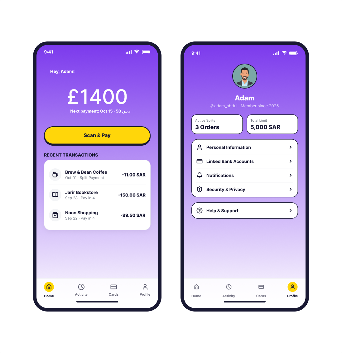
1. Snapchat-inspired immediacy — The app had to feel fast and frictionless, like opening Snapchat. No loading states, no unnecessary confirmations, one action per screen. Every tap should feel instant and satisfying. This speed-first mentality shaped the entire interaction model.
2. Yellow as a statement — We leaned into yellow not as a trendy choice, but as a locally rooted one. Football fans know yellow as victory and pride. In fintech, it signaled optimism and action—a color that said "fast, young, local" without feeling derivative. But we used it strategically: only for primary CTAs and key moments. Restraint made it iconic, not garish.
3. Hierarchical simplicity — Each flow centers on one clear action per screen. Secondary information (fees, rates, compliance notices) surface only when relevant. This kept the cognitive load low—essential for a market where many users were first-time digital finance users.
4. Consistent UI language — Every screen follows a strict pattern: status bar, header with back button, content area, and yellow CTA button. This trained users on navigation instantly, like the repetition you see in Snapchat Stories.
5. Strategic color use — Navy as the safe, premium foundation (the opposite of risky). Yellow as the action driver. Purple for trust/secondary flows (compliance, security details). Light blue for balance/progress states. Color backgrounds reserved for key moments (success, errors, verification states).
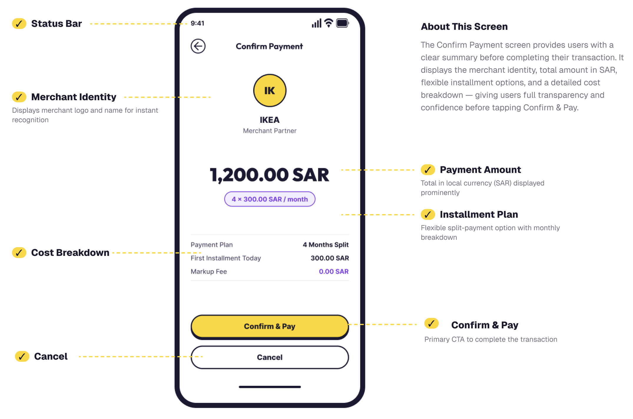
6. Transparent costs — Fees, installment breakdowns, and exchange rates displayed upfront with no hidden surprises. This builds confidence in young, first-time BNPL users—a direct counter to the "hidden fees" reputation fintech had earned.
7. Localization by design — Right-to-left support, Arabic typography, regional payment methods, and culturally appropriate imagery integrated from the start, not bolted on. The app felt designed for Saudi Arabia, not imported from elsewhere.
Core Flows & Features
Onboarding & Verification
Step-by-step identity verification via Nafath/National ID, phone confirmation, and credit checks. Compliance baked into UX, not a separate flow. Each step is focused and progressive, building user confidence as they move through the journey.

Scan & Pay (QR)
Real-time merchant checkout with QR scanning, automatic merchant identification, and one-tap payment confirmation. Error states handle invalid codes gracefully with clear recovery paths.
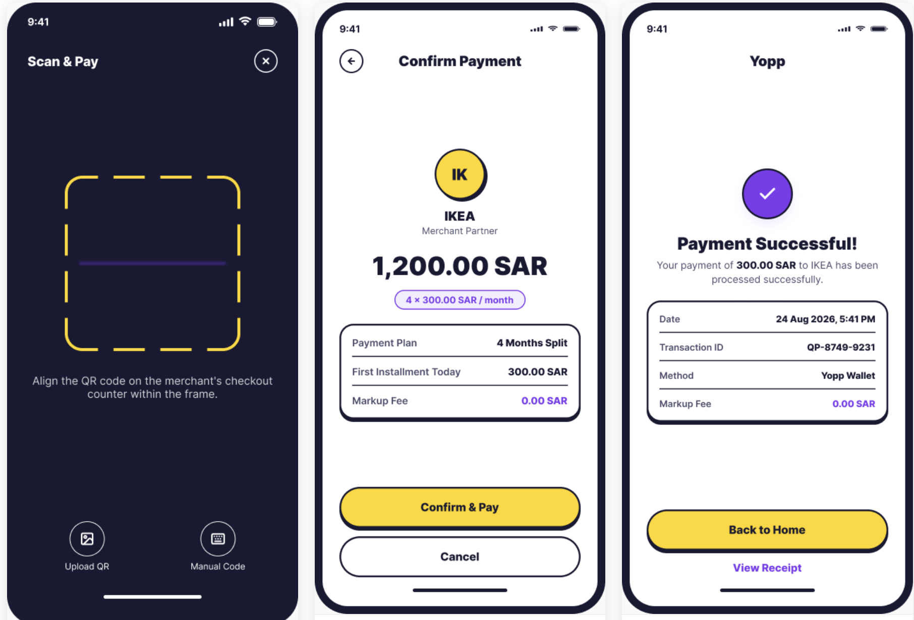
QR Scanner, Payment Confirmation, Success State
Peer Remittance
Send money across borders with real-time FX rates, recipient tracking, and instant delivery. Built for the diaspora use case with multi-currency support.
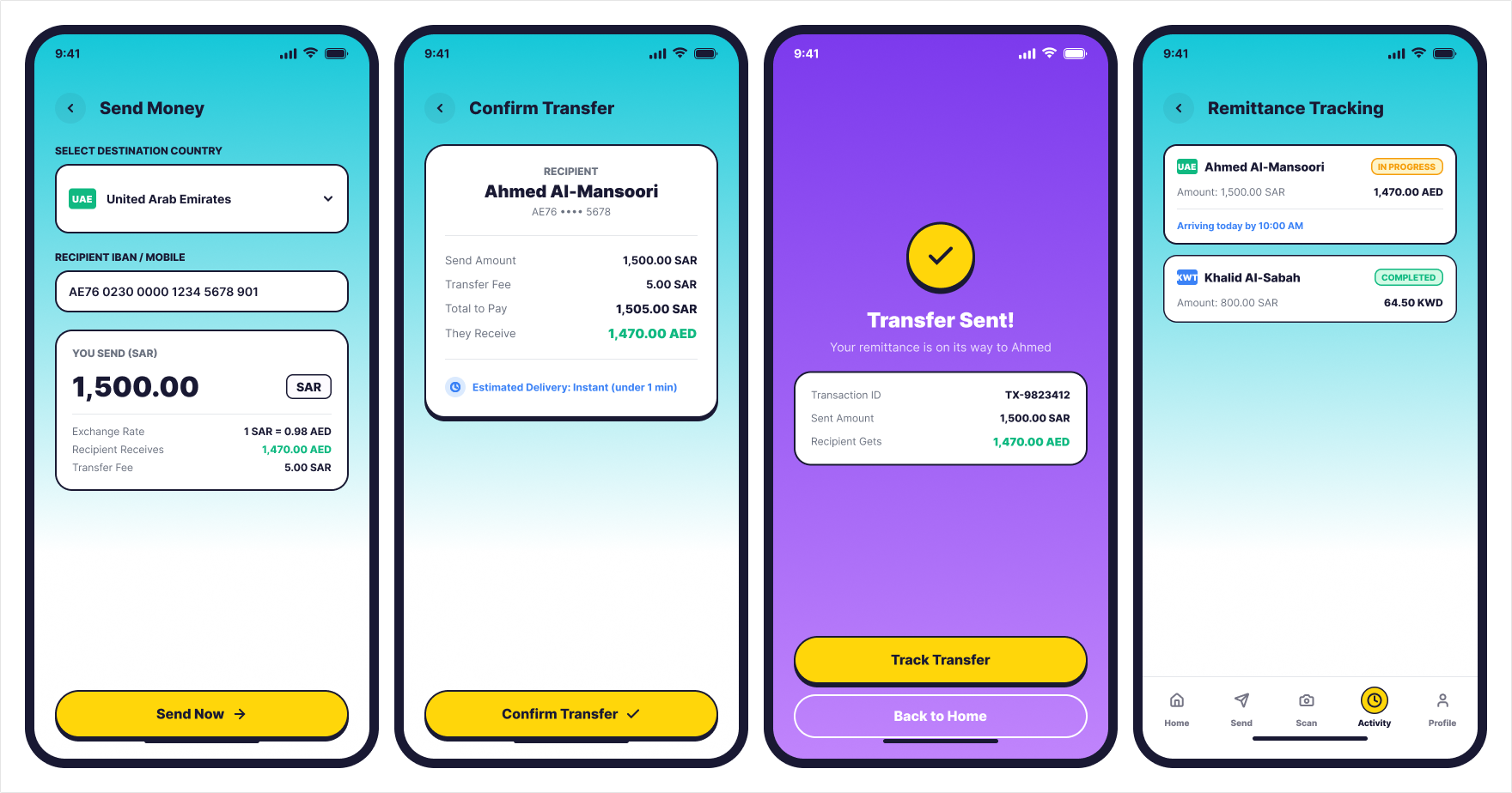
Brand & Design System
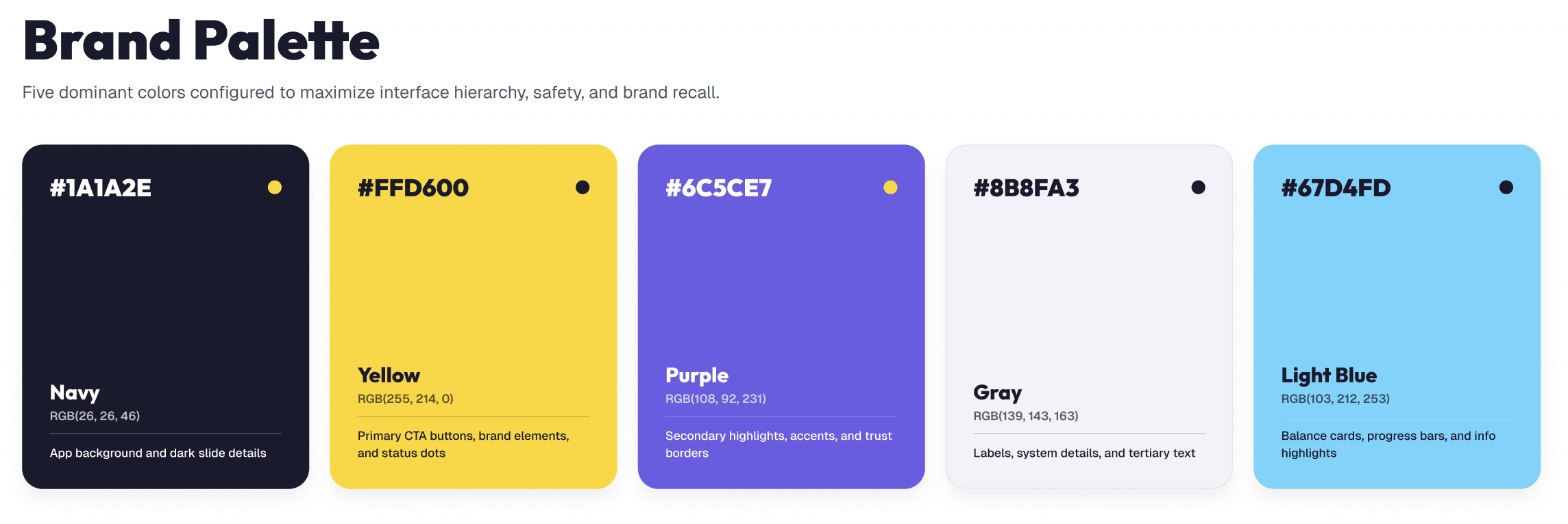
Navy as the safe, premium foundation—the opposite of "risky fintech." Yellow commands attention and signals action, but more importantly, it's locally rooted. Saudi football fans immediately recognize it as the color of pride and victory (Al-Nassr, Al-Hilal). In fintech, it's underclaimed. By using yellow sparingly and strategically, we owned a color that felt both modern and deeply local. Purple builds secondary trust (split details, security messaging, secondary actions). Light blue for progress, balance indicators, and uplifting moments—the feeling of money moving, barriers clearing.
The constraint: use yellow only for primary CTAs and key success moments. This restraint made it iconic. Every yellow button became a "this is the moment that matters" cue. This is the opposite of how most fintech brands use color—they treat the palette as decoration. We treated it as hierarchy and psychology.
Components & UI System
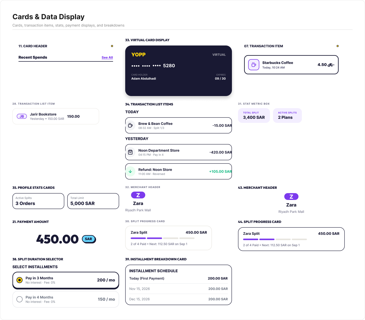
Cards, transaction items, stats, payment displays, and breakdowns—all built as reusable components within a cohesive design system.
Navigation & States
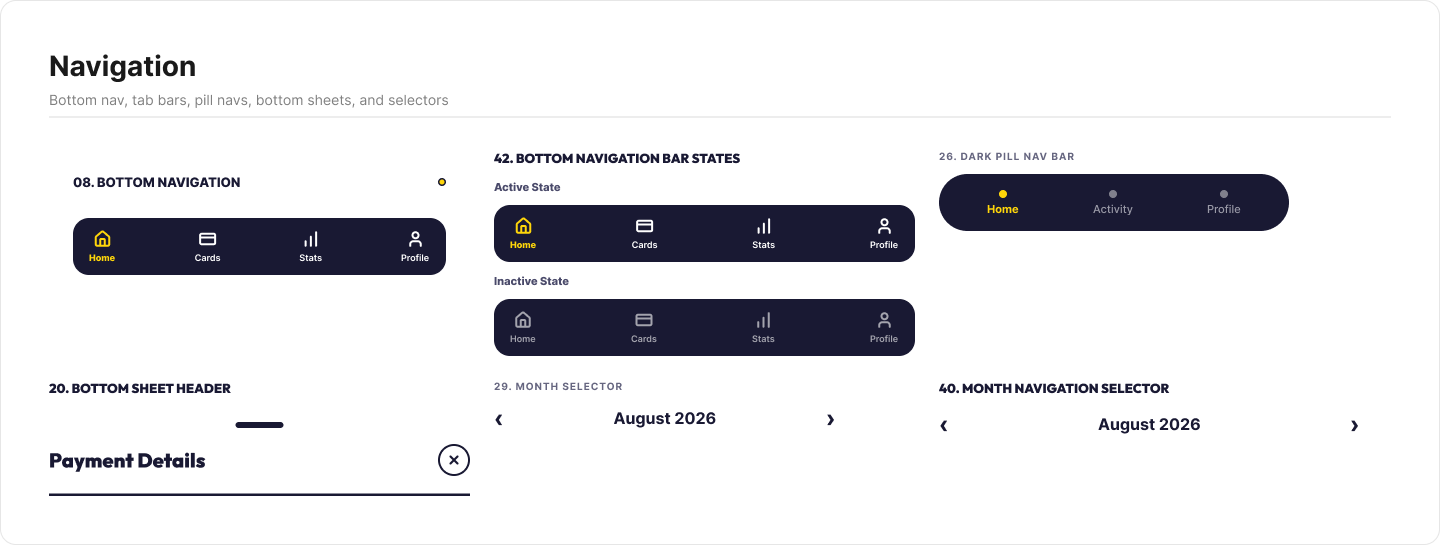
Consistent bottom navigation, pill-style navigation bar, and controlled tab states. Every interaction follows the same patterns across the app.
Key UI Principles
One action per screen — eliminate cognitive load; secondary info in collapsible cards
Consistent structure — every screen follows: header (back button + title) → content area → fixed yellow CTA + secondary option at bottom
Merchant identity — large merchant logo/badge above amounts; builds confidence, makes merchant clear immediately
Cost transparency — fees, splits, rates shown in a labeled breakdown card; no surprises at confirmation
Error clarity — red borders on invalid input, clear error messaging in place, and always a recovery path (retry, enter manually, etc.)
White space by default — color backgrounds only for key states (success = purple/blue, errors = red, verification = yellow)
Complete Screen System
Design translation: The system was handed off to engineering with a complete component library, interaction specs, and copy guidance. Developers built confident that every screen matched the brand.
User confidence: By surfacing costs upfront and maintaining strict visual consistency, first-time BNPL users could move through payment flows without friction or surprise fees—critical for trust in a new fintech app.
Competitive positioning: The bold yellow + navy identity became recognizable. Compared to competitors' designs, Yopp felt younger, faster, and built for Gen-Z—not a financial institution that happened to go mobile.
Scalability: The design system proved flexible enough to support new features (referrals, cashback, bill splitting) without breaking the core language.
Key Learnings
Constraint breeds clarity. Limiting ourselves to one CTA per screen forced clearer flows and taught users the interaction pattern by repetition.
Trust > flashiness. Transparent cost breakdowns mattered more than animation or microinteraction polish. Gen-Z fintech users are risk-aware; show the full picture upfront.
Compliance is UX. Embedding regulatory requirements (verification, Shariah checks) into the user journey—rather than treating them as edge cases—made the experience smoother and built confidence.
Color is hierarchy. Using yellow sparingly as the primary CTA made every screen scannable instantly. Restraint made the system stronger.
Ship with a system, not just screens. Handing off a cohesive design system (components, tokens, patterns) meant engineering could extend confidently without designing as they built.
Market research informs design. Understanding the competitive landscape and user psychology upfront meant every design decision was anchored in strategy, not guesswork.
Conclusion
The result was a recognizable brand many screens across five payment flows, and a design system engineering could extend without redesigning on the fly. The biggest lesson was that trust beats flash. For first-time BNPL users, a clear fee breakdown did more than any animation could, and building compliance into the journey made the product feel smoother, not heavier.