Case Study: Call of Duty: Modern Warfare III, Create-a-Class Rewired
On a live-service game with millions of daily users, UX success is measured by low friction rather than novel UI layout.
STUDIO: Activision / Sledgehammer Games
SHIPPED: November 2023
ROLE: Senior UX Designer
SCOPE: Loadouts, Gunsmith, progression
INTRODUCTION
A new game in a familiar frame.
I worked on Modern Warfare III as a Senior UX Designer within a wider team of designers, UI artists, producers and engineers. This case study covers the multiplayer loadout experience: create-a-class, the Gunsmith and progression.
MWIII changed a lot underneath. Perks were rebuilt as wearable gear, progression moved away from MWII's weapon platform tree, and every weapon and cosmetic a player owned in MWII carried forward. Our job was to make all of that easy to understand without rebuilding the front end around it.
CONSTRAINTS. We couldn't reinvent the wheel.
Most of what you see in a Call of Duty menu is shared. That shaped every decision.
A fixed shell. The hub and launcher, navigation, tabs, tile components and button prompts are shared across titles and Warzone. We designed inside them, not around them.
Years of muscle memory. Create-a-class and the Gunsmith follow patterns players have used across several games. Breaking them would cost players more than any new idea gained.
Two games of content. Every change had to work for MWII items carried forward, not just new MWIII ones.
Controller first, many languages. Everything had to read from the sofa, work with a pad, and survive translation without breaking layouts.
An annual timeline. There was no room for a ground-up redesign, so the work had to be targeted.
So the real question was never "what should this screen look like?" It was "what can we change inside the patterns we have, so the new systems make sense?" The answer was mostly content, hierarchy, states and copy.
WHAT WE HEARD
Player feedback set the priorities.
MWII's systems were deep but hard to read. Players struggled with Perk Packages, where abstract icons came in fixed bundles and some only activated mid-match. They were openly critical of weapons that unlocked by levelling other weapons.[src] Carry Forward would then add a second game's content to every list.
That feedback, and our own discussions as a team, gave us three goals: make perks easy to recognise, keep a doubled arsenal readable, and say trade-offs in plain language.
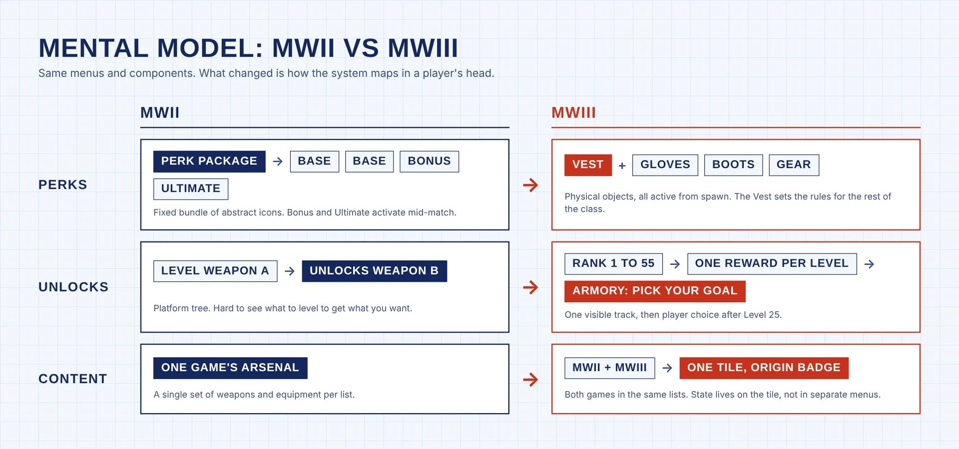
OVERVIEW The shift at a glance. Same menus; a different map in the player's head.
01 / GEAR. New meaning, same loadout row.
The move from perks to gear (Vest, Gloves, Boots and Gear) was a game design decision. The UX challenge was presenting it without a new screen type. We kept the familiar loadout row and picker, and let the objects do the explaining: boots mean movement, gloves mean handling. The Vest needed the most care, because it changes what the rest of the class can hold.
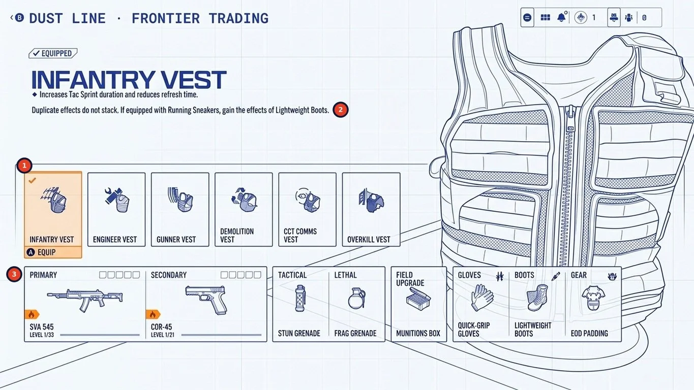
FIG 01 Vest selection, redrawn as a blueprint. The standard picker, focused on consequence.
A small, scannable set. Six vests in the standard tile row, each with one clear role.
Conflicts in plain language. "Duplicate effects do not stack" is written where the conflict happens, not left for players to discover.
The loadout stays visible. The existing loadout strip sits under the picker, so a vest swap shows its knock-on effect before you commit.
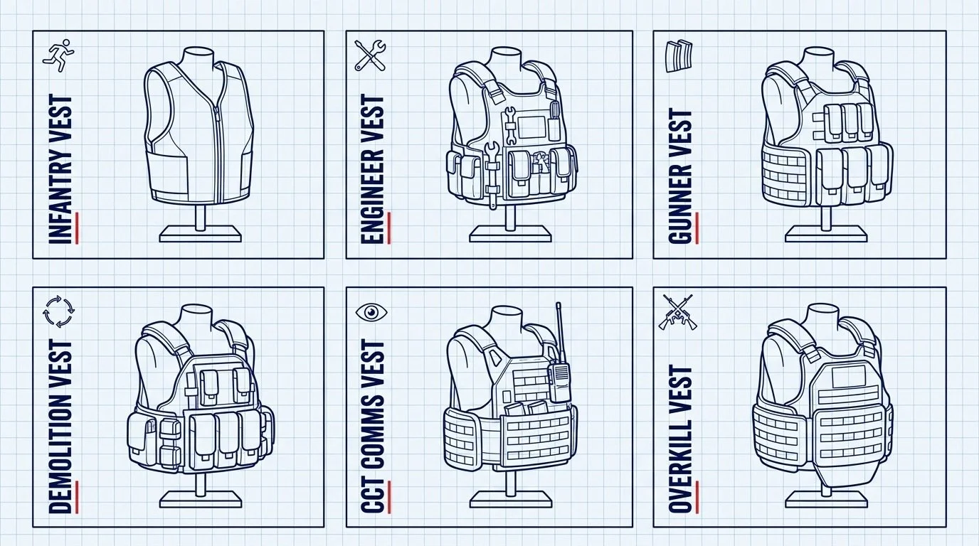
FIG 02The vest range. Physical objects players can read at a glance.
02 / SCALE. Two games of content, one tile.
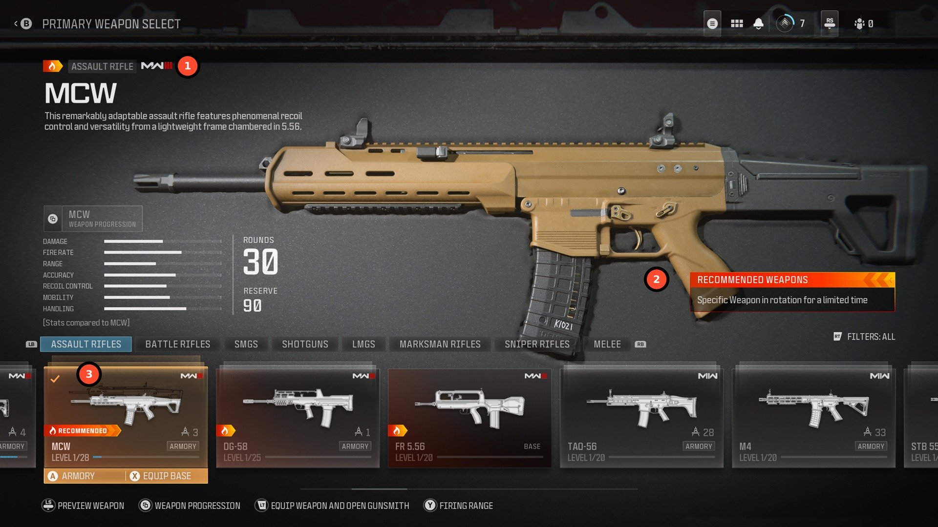
We couldn't add new navigation to separate MWII and MWIII items, and splitting them would have made players hunt. Instead we used the existing weapon tile and gave it more to say: a small origin badge, the weapon's level, a Recommended flag and how it unlocks. Origin is always visible but never the headline.
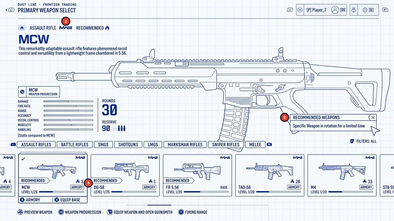
FIG 03Weapon select, redrawn as a blueprint. Same tile, more states.
Origin badge. One MWIII or MWII mark, used the same way on weapons, attachments and equipment.
Recommended Weapons. A rotating flag that gives a long list a starting point.
Tile states. Level, Recommended, and Armory or base unlock, all on one card.
03 / GUNSMITH Say the trade-off before the number.
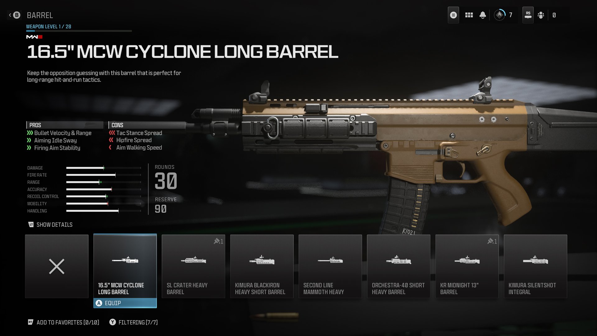
The Gunsmith is one of the most established patterns in the franchise, so its structure stayed. The work was in hierarchy: with MWII attachments carried forward, each one had to make its trade-off clear fast. Plain-language pros and cons lead, the full stat sheet sits one press away. Casual players read the words; buildcrafters open the numbers.
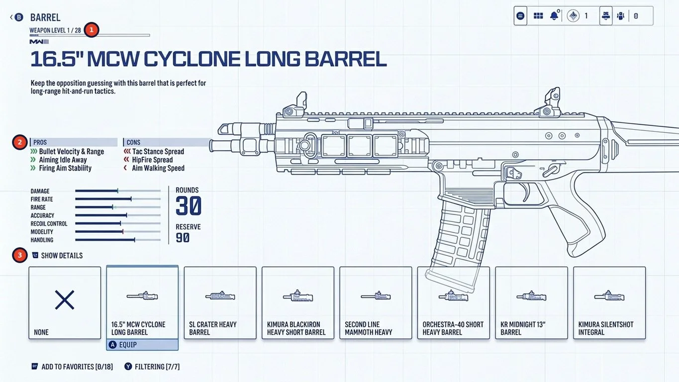
FIG 04Attachment picker, redrawn as a blueprint. Words first, numbers on demand.
Weapon level always visible, so players know why a part is locked.
Pros and cons in plain language before any stat bar.
Show Details opens the full stat sheet for experts.
04 / PROGRESSION. Clarity exposes pacing.
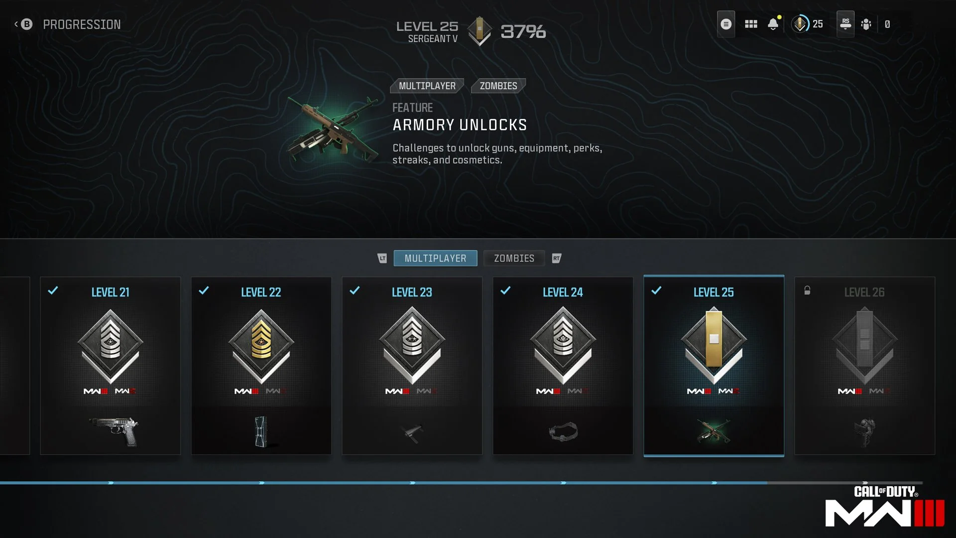
Progression moved to a single rank track with one visible reward per level. After Level 25, Armory Unlocks let players choose what to earn next. The menus did their job: players understood the system. But at launch many found the Armory grind too slow, and a patch on 21 November 2023 let wins count toward unlocks.
A clear UI makes a grind easy to see. Interface and economy have to be tuned together.
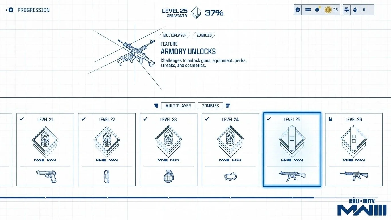
FIG 05Rank progression, redrawn as a blueprint. One track, one reward per level.
CONCLUSION
None of these changes needed a new screen. The shell, the components and the patterns players already knew all stayed. What changed was what those patterns communicated: objects instead of icons, states instead of separate lists, words before numbers. That's what working on a long-running franchise looks like. You earn change by respecting what players already know.
01 Work with the system. Shared patterns are an asset. Change what they say before changing what they are.
02 Show consequences in context. When one choice changes others, show the whole result at the point of decision.
03 Design UX and economy together. Legibility helps players understand a system. It can't make the pacing feel fair by itself.