Case Study: Designing a Trading System for an Open World Game
Role: Senior UX Designer | Platform: Console, controller first | Game: Unannounced | Date: June 2026
The short version
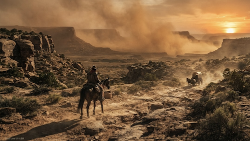
I designed and owned the buy/sell flow for a trading experience for an upcoming AAA game. Readable at a glance, decided on a controller, never spreadsheet homework. Some details still under NDA. A game set in a fictional 1890s Wild West frontier. In Dust Line, the vendor isn't a generic RPG shop. It's a changing market you read, a wagon you can't overfill, and a trade you have to earn.
This isn't a shop screen where you buy the best sword. It's a market where price, demand and weight all push back.
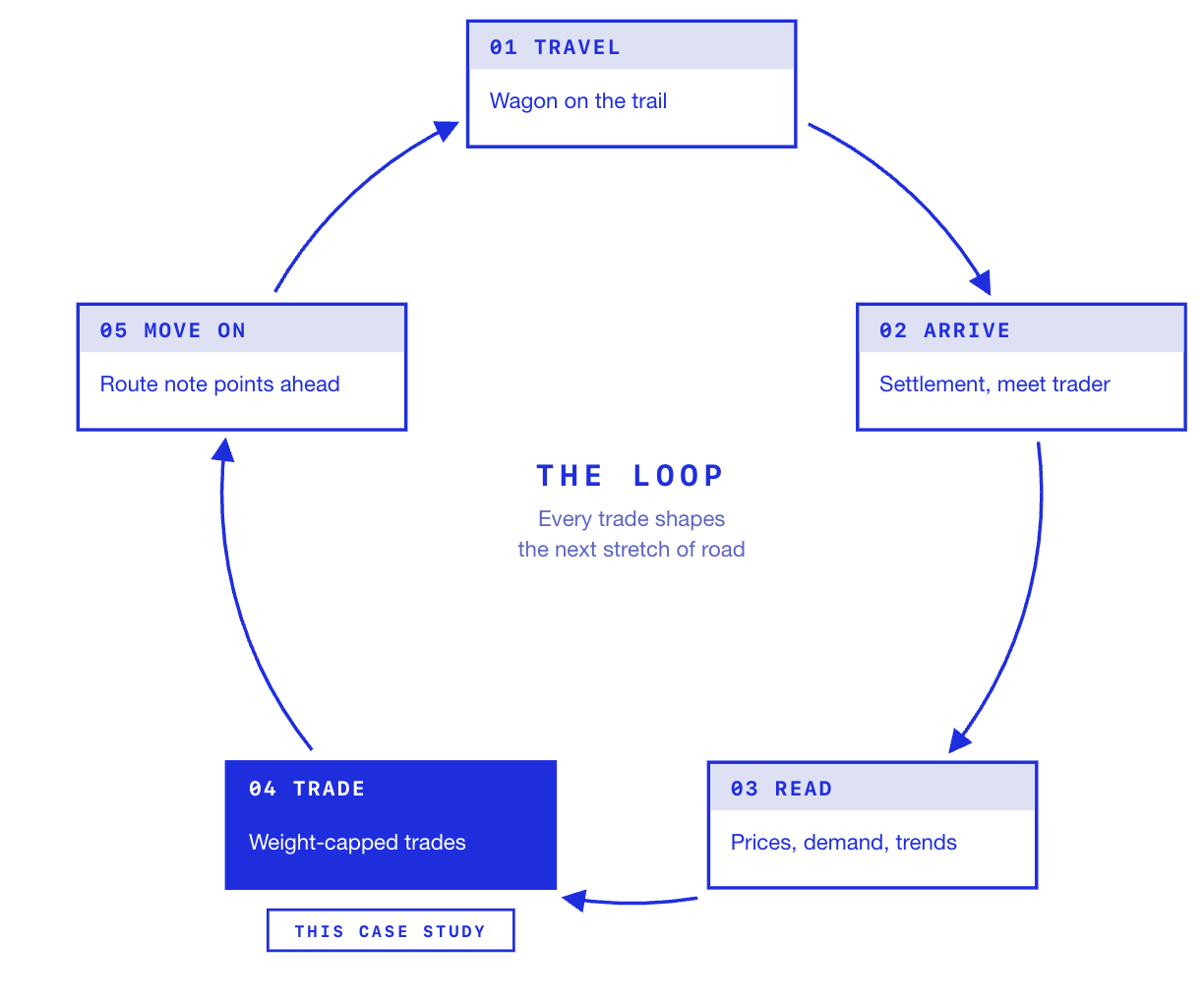
The vendor isn't a side menu. It's a checkpoint in the core loop, and every trip through it shapes the next stretch of the journey.
The games Core Loop
Travel the trail with a wagon that can only carry so much
Arrive at a settlement and meet the trader
Read the market: what's cheap, what's in demand, what's trending
Trade goods for gold, within a weight limit
Move on, carrying a route note that hints at where prices are better
That makes the screen a strategy layer as much as a shop. Weight forces choices, demand rewards paying attention, and the route note pulls the player back onto the trail. If the vendor flow is slow or confusing, the whole loop feels heavier. If it's quick and readable, players trade more, plan more, and enjoy the road between stops more.
The problem
A trading screen has to answer four questions fast:
What is this worth?
Is that a good price right now?
Can I carry it?
Can I afford it?
The trick is answering all four without confusing the player. Too little info and they trade blind. Too much and every purchase feels like a tax return. And it all has to be readable from a sofa, one thumb at a time.
Constraints
Controller only. No cursor, no hover, no tooltips
Dozens of goods, each with price, weight, stock and demand
Weight is a real limit, so every purchase has a hidden cost the player needs to see
Prices move, so players need to read trends, not just numbers
Has to plug into the studio's existing plans
UX scope
What I owned
Vendor entry and dialogue options
Buy and sell ledger, including filter, sort and pagination
Item detail and advanced info panels
Purchase confirmation and receipt
Error and edge case states (gold, capacity)
How wagon weight and gold surface in the HUD during a trade
What I did not work on
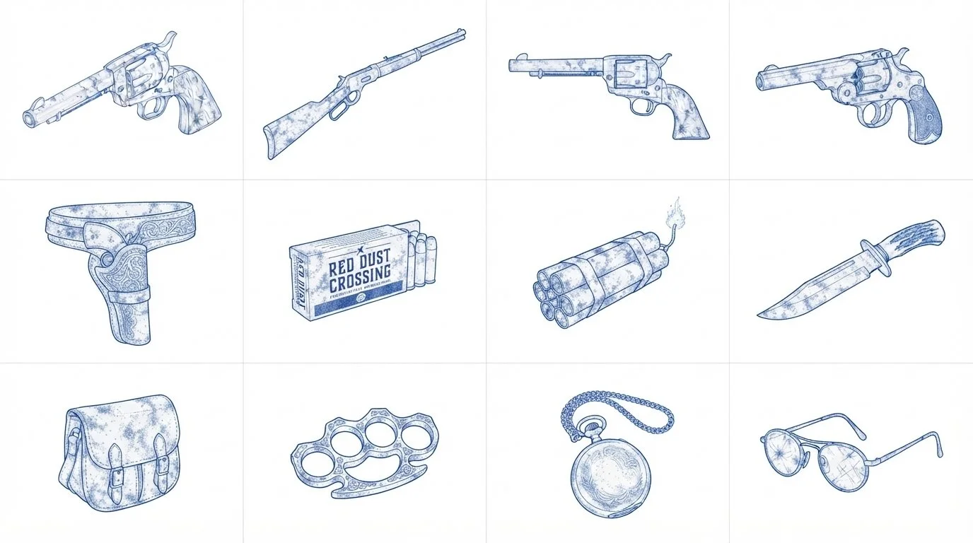
Art and item illustration
Button Mapping
Economy and pricing data
The wider inventory system
Deliverables
Flows, wireframes, annotated specs, prototype.
The flow
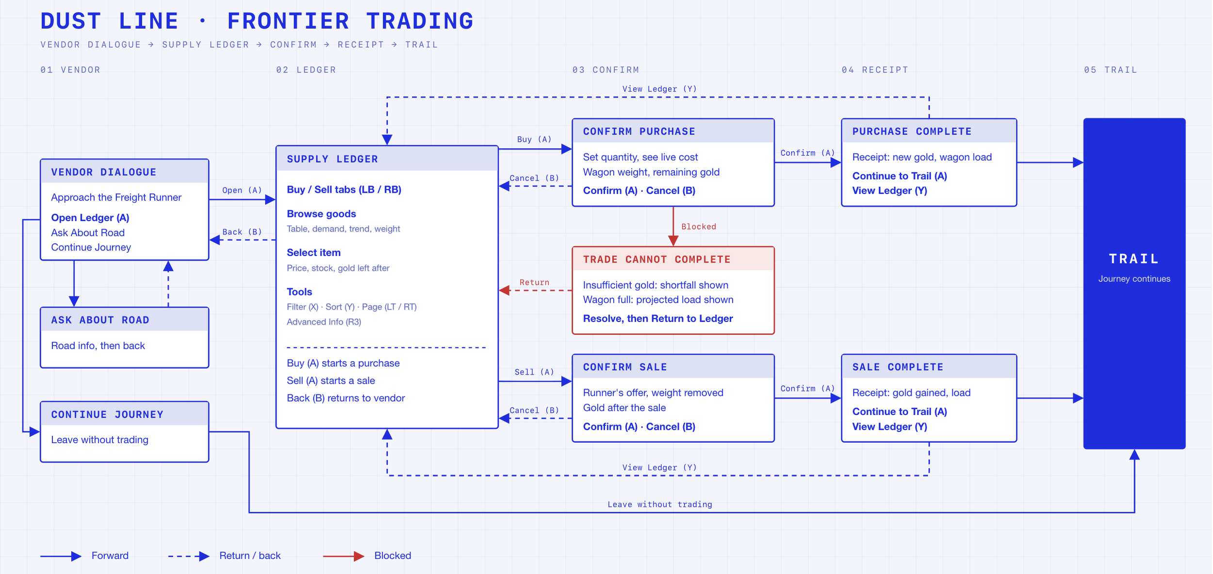
Before any screens, the flow. Four stages: talk to the trader, browse the ledger, resolve the trade, get back on the trail.
1. Meeting the vendor
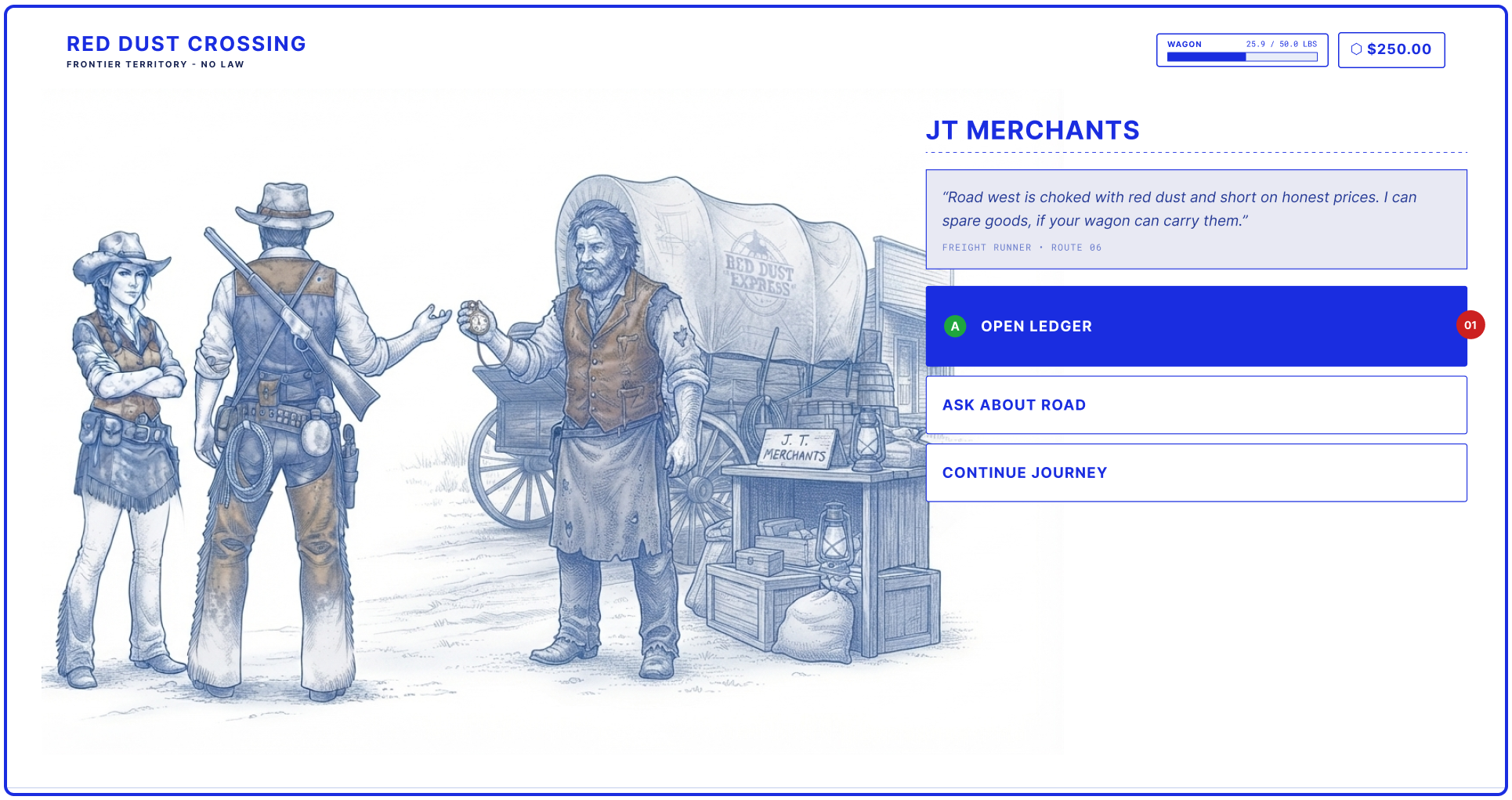
01 One clear primary action. "Open Ledger" is focused by default and mapped to A, so the most common path is one press
Wagon weight and gold sit in the top corner from the very first screen, so the player carries that context into the trade
Secondary options (Ask About Road, Continue Journey) stay quiet but always reachable
Before the ledger, there's a person. The trader gets a line of dialogue, a face, and three choices. It sets the tone and gives the player a beat before the numbers start.
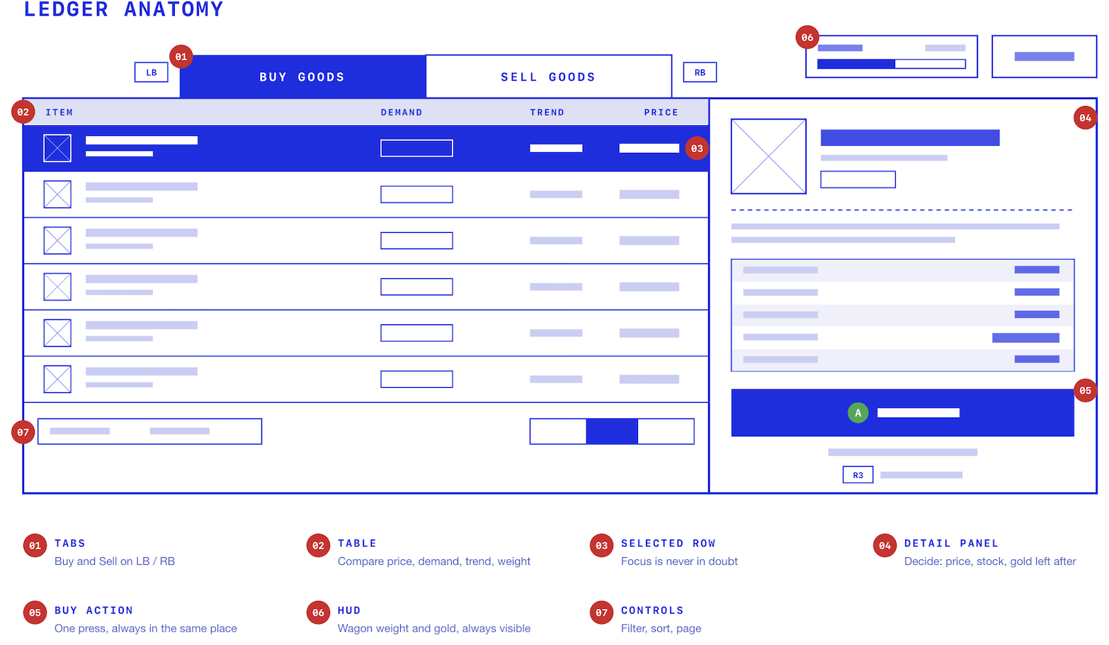
2. The main ledger
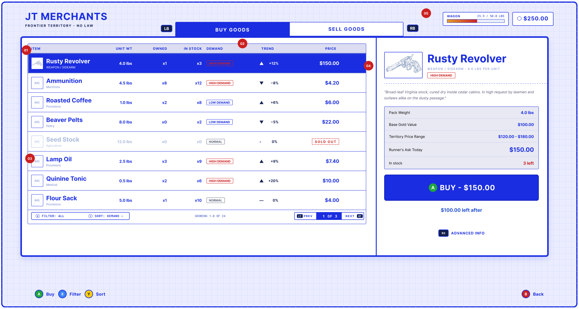
01 Table and scale: Eight rows per page with filter, sort and LT/RT pagination. Enough to browse, not enough to overwhelm
02 Accessible demand: Demand and trend are shown with text and direction, not just colour. Nobody has to guess what red means
03 Catalog context: Sold out goods stay visible but greyed. Players learn what exists in the world, not just what's on the shelf today
04 Fixed scan order: Columns never move. Muscle memory builds fast when the layout stays put
05 Capacity HUD: Wagon weight and gold stay visible at all times, so the player sees limits before they commit
This is the heart of it. A list on the left, a detail panel on the right, and everything the player needs to decide without opening a menu.
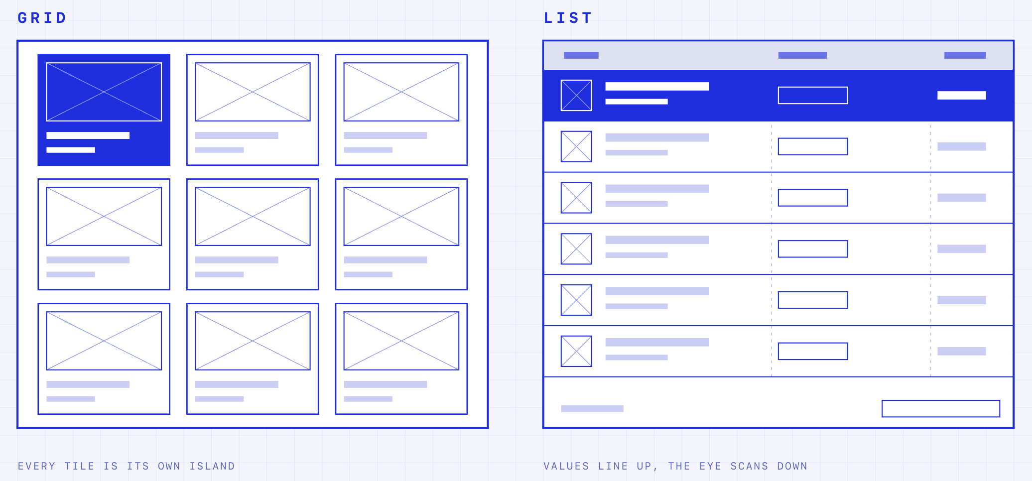
Grid vs list?
GRID VIEW
Whatever it is, the way you tell your story online can make all the difference.
Why the list won
A tableview is the right call because the whole pitch of this game is "the economy is visible at a glance." That only works if you can compare demand, price, weight, and stock across every item at once, and a table's the one layout that shows all four and more if needed without clicking into anything. A grid would make you open each tile just to see what a table gives you for free.
Comparison: price, demand, trend and weight sit side by side
One axis: up and down suits a controller and keeps the D-pad simple
Stable scan order: sort and filter change the order, never the layout
Text first, art second: the detail panel still gives the selected item a large image
Trade-off: fewer goods on screen and less visual browsing. Fine, because the player is deciding, not window shopping.
3. Advanced info, on demand - Progressive disclosure
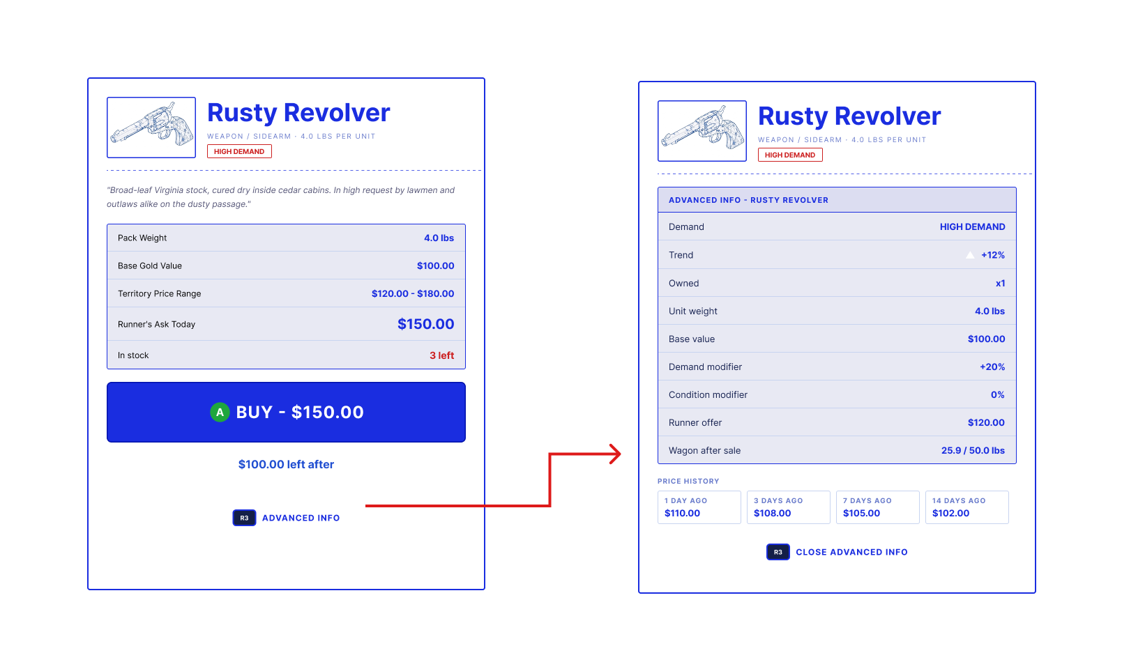
Default view stays light: weight, base value, territory range, today's price, stock
The deep view shows the maths: demand modifier, condition modifier, runner offer, wagon weight after the sale
Price history (1, 3, 7 and 14 days) lets players spot a trend instead of taking the number on faith
Progressive disclosure, not a separate screen. The player never loses their place in the list
Most players just want a price. Some want to know why. Advanced info swaps the detail panel for the full breakdown, on one button press (R3), and swaps back on the same button.
4. Filter and sort
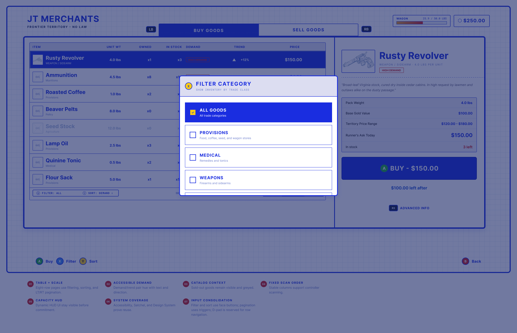
07 Input consolidation: Filter and sort live on face buttons, pagination on triggers, and the D-pad is reserved for moving through rows. Nothing competes for the same input
Category filters carry a one line description, so the labels teach the player how the economy is organised
The overlay sits on top of the ledger rather than replacing it, so context is never lost
06 System coverage: Built to reuse the accessibility, Satchel and Design System patterns already in the game
5. Selling
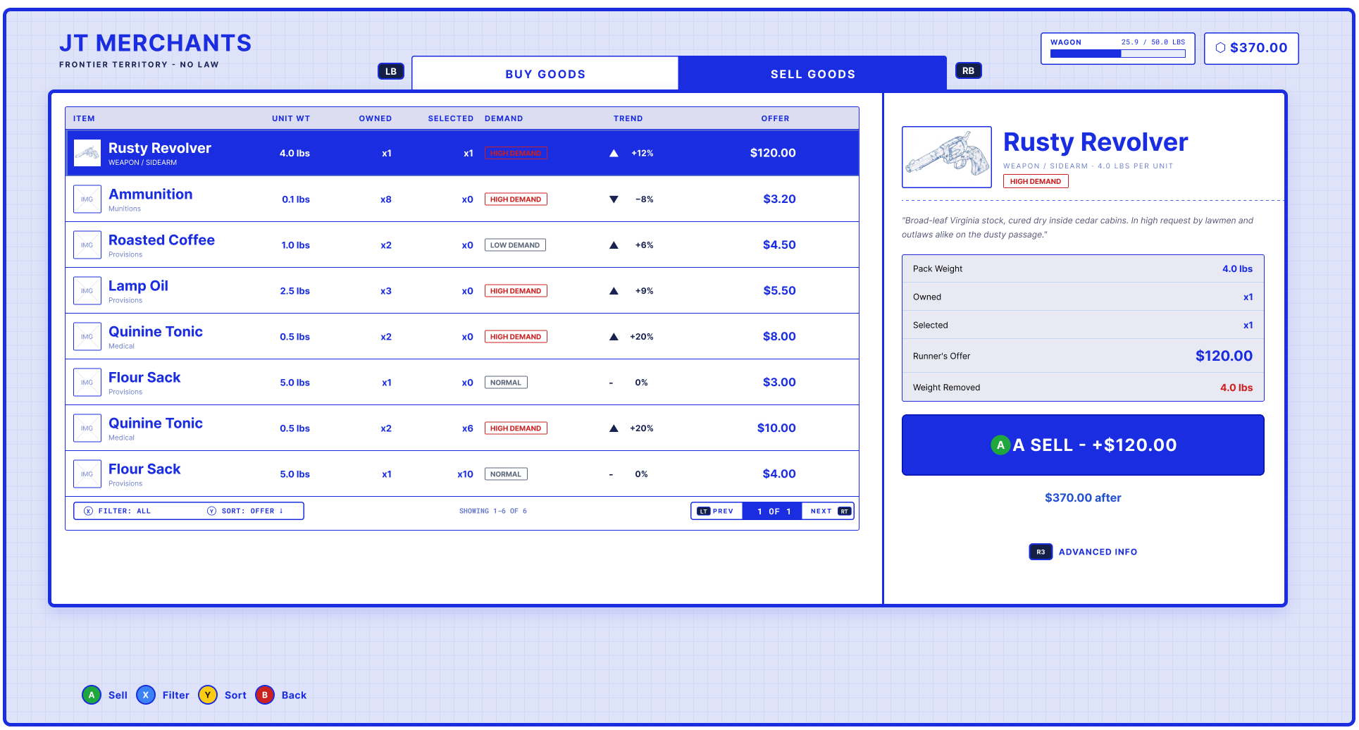
The same layout as Buy, so there's nothing new to learn
Mode switches on LB/RB, so the player can flip between buying and selling without backing out
Selling isn't just buying in reverse. The player only cares about what they own, what it will fetch, and what it frees up.
6. Confirming a purchase
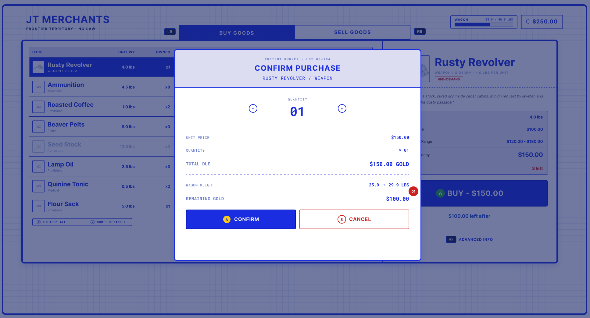
01 The consequences are shown before the commit: wagon weight (25.9 to 29.9 lbs) and remaining gold, side by side
Quantity is adjustable right here, with the totals updating live
Confirm and Cancel are equally easy to reach, so there's no pressure to rush
Money leaves the player's hands here, so this is where the screen slows down and gets very clear.
7. When a trade fails
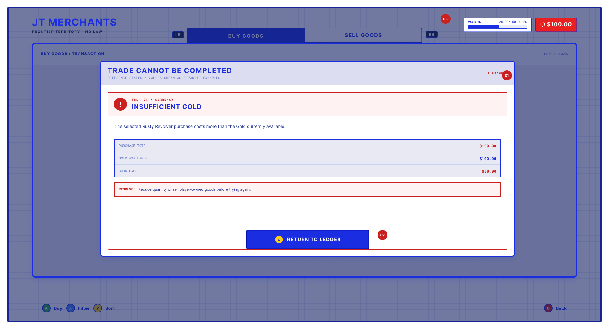
Errors are part of the flow, not an afterthought. A player who hits a wall should know exactly why and exactly how to get past it.
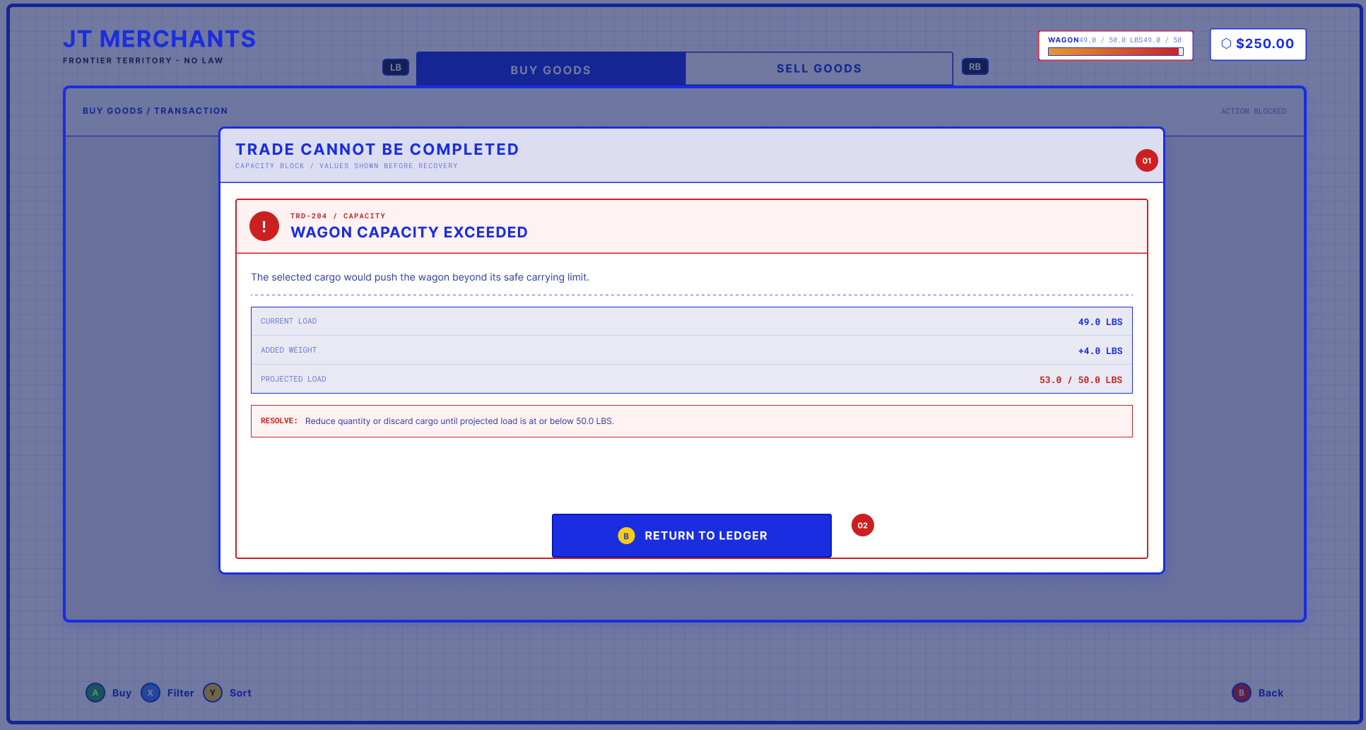
01 Same structure as the gold error, so the player already knows how to read it
Current load, added weight and projected load show exactly how far over the limit they are
02 The fix is stated plainly: reduce quantity or discard cargo until the load is at or under 50 lbs
Two different failures, one consistent pattern
8. Closing the deal
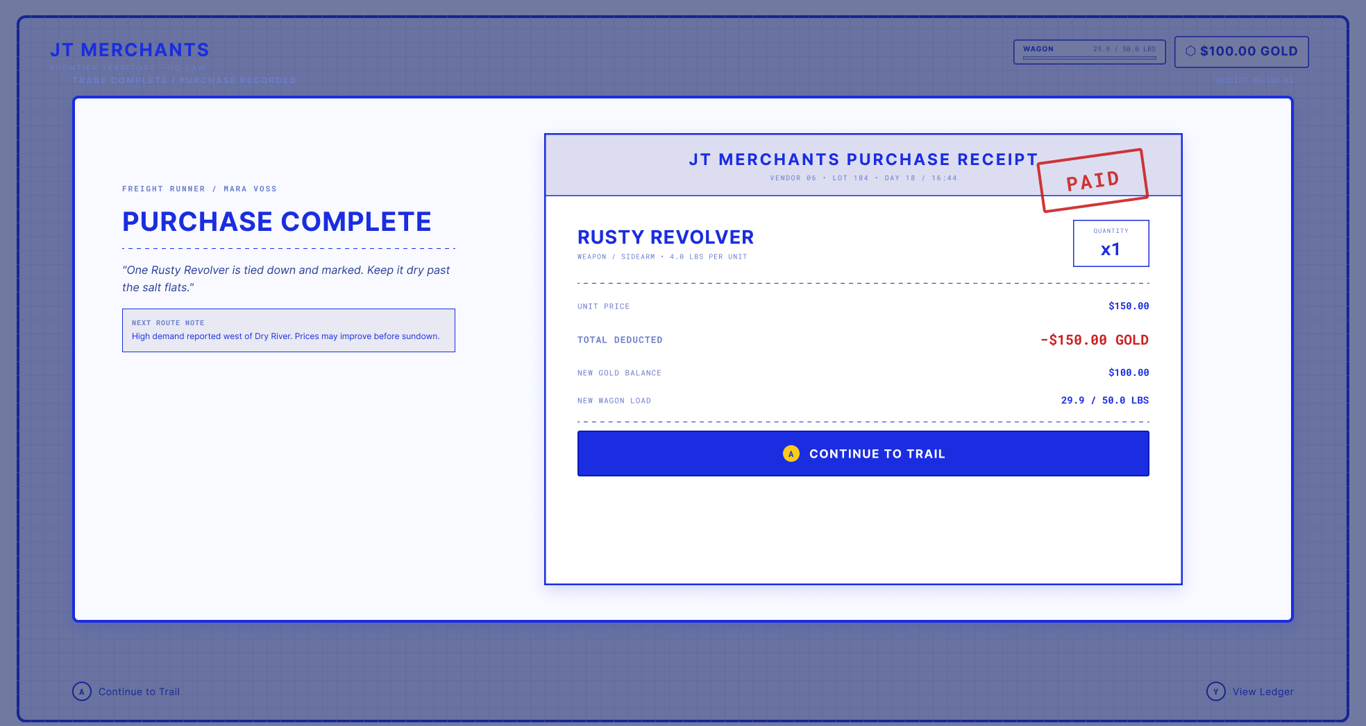
A "PAID" stamp turns a transaction into a tiny bit of theatre
New gold balance and wagon load are restated, so nothing is a surprise later
A short line from the Freight Runner and a route note point the player back towards the journey
Continue to Trail is the primary action, and View Ledger is one press away if they want to keep trading
A trade should feel like it happened. The receipt gives the player a small moment of closure, and one last check that the numbers are what they expected.
What I'd want you to take from this
Show the cost before the commit. Weight, gold and consequences are visible before the player presses anything
Progressive disclosure beats a wall of numbers. Simple by default, deep when asked
Design for the controller, not around it. Every input has one job
Errors are UX too. They're some of the most important screens in the flow
Consistency is what makes it fast. Same layout, same buttons, same patterns, in every state
Reflection
Trading screens are some of the least glamorous UI in a game and some of the most used. Getting them right is a quiet kind of craft: no one notices when it works, and everyone notices when it doesn't. That's the kind of design problem I enjoy most.
If I did it again, I'd test the advanced info panel earlier with players who don't normally read economy screens.
Due to NDA, the game, studio and final designs are not shown. The screens on this page are a rebuilt version of the flow in a fictional setting, made for this portfolio. The thinking and the structure reflect the real project.