The $10,000,000 Tutorial: Why Onboarding is Your Most Profitable Mechanic
Most Games studios treat onboarding likea "necessary evil" before the player gets to the "real" game. They are dead wrong.
Your tutorial isn't teaching the player how to play; it’s teaching them why they should stay. If they haven't felt like a absolute hero in the first 60 seconds, you haven't onboarded them—you've just bored them.
Time to Fun (TTF): The Golden Metric
Time to Fun is the speed at which a player reaches their first meaningful "win" or "dopamine hit" after hitting the play button. In the 2026 landscape, top studios treat the first sixty seconds of a game like a conversion funnel.
Kill the "Tutorial Wall": Don't force players through three minutes of text boxes before they can move.
The "Small Win" Strategy: Give the player a minor victory (a loot drop, a level up, a satisfying explosion) within the first thirty seconds.
Invisible Onboarding: Teach mechanics through action, not instructions. If they need to learn to jump, put a small gap in front of them, not a manual.
Onboarding players, not captives
A tutorial assumes the player is trapped until they press “Next.” Onboarding assumes the player is always one friction point away from leaving. The mindset shift is simple but radical:
The “customer” of onboarding is a skeptical, curious player who owes you nothing.
The “job” of onboarding is to get them from “What is this?” to “I get it, and I want more” as fast as possible.
In a world of F2P and subscription services, Onboarding IS the game. If you have a 40% drop-off in the first 10 minutes, you don't have a retention problem; you have a "Value Delivery" problem. You are spending millions to acquire players only to punch them in the face with a wall of text.
To make onboarding "the best part,"
Increase the Dream Outcome: Don't teach them how to "press X to jump." Show them the power-fantasy they bought the game for within the first 30 seconds.
Increase Perceived Likelihood: Give them a "Micro-Win" immediately. Make them feel competent, not like a student in a classroom.
Decrease Time Delay: Get them to the "Aha!" moment (the core fun) faster. If your game is a shooter, they should be shooting something in < 45 seconds.
Decrease Effort & Sacrifice: Stop making them read. If they have to read a paragraph to understand a mechanic, your UX has failed.
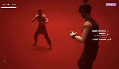
The Invisible Teacher: How Portal 2 Mastered the "Non-Tutorial"
In the world of UX design, there is a legendary rule: "If you have to explain it, it’s broken." Most software hides behind pop-up "tours" and tooltips, but Portal 2 achieves something far more difficult. It teaches the player complex 3D physics and logic without a single tutorial box.
Hidden Tutorials: Elden Ring "teaches" you through death. Many players miss the literal "Tutorial Hole" at the start because the game doesn't force a pop-up on your screen.
Here is how Valve used Scaffolding and Psychology to turn a game into a teacher.
🧱 The Strategy: Scaffolding
Growth.design often talks about Cognitive Load. If you give a user 10 new buttons at once, their brain "freezes." Portal 2solves this through a process called Scaffolding:
Isolation: The game places the player in a room with only one possible action (e.g., "Press this button to open that door").
Validation: Once the player succeeds, the game gives a "Reward" (a funny line from GLaDOS or a dinging sound).
The Twist: The next room has the same button, but now it’s on the ceiling. The player must use their "Old Skill" in a "New Way."
💨 The Pain Point: "Tutorial Fatigue"
We’ve all experienced it: you open a new app, and 5 "Next" buttons appear, pointing at different icons. The result? We click "Skip" as fast as possible.
The Player's Reaction: "Stop talking and let me play."
The Portal Solution: The "Tutorial" is the first two hours of the game. By the time the player reaches the "Hard" levels, they have been trained so subtly they feel like a genius—not a student.
🛠️ UX Insight: The "Safe to Fail" Environment
In Portal 2, there are very few ways to actually "die" early on. If you shoot a portal in the wrong place, nothing bad happens.
The Lesson: High-stakes failure (like losing a level) creates Performance Anxiety.
The Design: By making the environment a "Safe Sandbox," the player is encouraged to experiment. In UX terms, this is the "Undo" button of game design. It lowers the cost of exploration.
⚠️ Considerations
Breaking the Rules: If the game teaches you that "Wood is portal-able" and then later makes wood non-portal-ablefor no reason, the trust between the "Teacher" and the "Student" is broken.
The "Veteran" Boredom: Pro-players who played Portal 1 might find the "Invisible Tutorial" of Portal 2 too slow. Good UX must account for the "Expert" user who wants to skip the basics. 📈
Accessibility: Using "Light" and "Sound" to teach works great, but what about players who are colorblind or hard of hearing? Portal 2 uses Cross-Sensory Feedback (closed captions and distinct shapes) to fill this gap.
Kill the "Manual"
If you need a tooltip to explain a UI element, the UI is broken. Good onboarding uses Environmental Affordances. Use lighting, sound, and level design to "nudge" the player's behavior without them realizing they are being taught.
The "Dopamine Breadcrumb" Trail
Every 60 seconds in the first 10 minutes, the player needs a reward.
Reward 1: Aesthetic (Cool explosion/view).
Reward 2: Mechanical (Unlocked a new move).
Reward 3: Social (A compliment from an NPC or a leaderboard ping).
The Goal: Make the act of learning feel like winning.
Frontload the "Cool"
Most games save the best mechanics for Hour 20. Hormozi would tell you to give them a "taste" of the Max-Level power in the first 5 minutes (The "Metroid" approach). Let them feel what it's like to be a god, then take it away. Now they have a Reason to Grind.
Build it like a product slice
Product teams ship a small, valuable slice and iterate. Onboarding should work the same way. Think in terms of a vertical slice of your game:
Let players perform the core loop (fight, move, build, solve… whatever defines your game) within a few minutes.
Wrap that loop with just enough UI and narrative to make sense, not every system you plan to ship.
Strip away non‑essential features at the start; complexity can be unlocked later when players have context and motivation.
Your onboarding “MVP” is not a wall of pop‑ups. It’s a tiny version of your game where the player can already feel smart, powerful, or curious.
Replace lectures with scaffolding
The worst tutorials lecture players; the best onboarding quietly rigs the world in their favor. Use scaffolding instead of explanation:
Bias early encounters so success is highly likely, even if the player is clumsy.
Use level design, camera framing, and enemy placement to suggest what to do before text ever appears.
When text is needed, tie it tightly to action: one hint, one input, one immediate payoff.
Every time you’re tempted to write three paragraphs, ask: “Can level design, pacing, or UI affordances make this clear instead?”
Make onboarding a living experiment
If onboarding is a product, it has metrics, hypotheses, and updates. That means:
Track key moments: where players quit, where they get stuck, which screen they linger on, which feature they never touch.
Treat changes like experiments: “If we remove this pop‑up and guide with environment cues, do completion rates improve?”
Revisit onboarding when you add big features, change the economy, or shift the target audience. It must evolve with the game, not fossilize.
When the live team talks about balance and monetization, onboarding should be in that conversation. It is your conversion funnel from “installed” to “invested.”
Put your best design in the first 10 minutes
Many teams save their cleverest ideas for hour three. Players might never see them. A product mindset flips that:
Front‑load one memorable moment that captures your game’s soul—a power spike, a narrative twist, a beautiful vista, a clever mechanic.
Use onboarding to earn the right to explain more later: once players feel something special, they’ll tolerate a bit more guidance.
Onboarding isn’t the prelude to the real game; it is the first release of your game’s promise. When you design it as a living product—measured, iterated, and respected—you don’t just teach mechanics. You win belief.
How hyper‑casual teams test onboarding
1. Prototype → marketability → onboarding
Teams rarely build the full game first.
They start with a tiny prototype and run CTR tests on ad creatives (10–15 second videos) to see if the core idea even attracts clicks; only promising concepts move on to a playable build.Once basic marketability is proven (acceptable CTR and CPI), they build 5–10 levels and wire in the simplest possible onboarding: one control scheme, one core loop, almost no meta.
That “Level 1–3 + basic HUD + basic tutorial hints” bundle is treated as a separate product: it gets its own metrics, experiments, and prioritization before the rest of the game is expanded.
2. A/B testing flows, not just buttons
Hyper‑casual live ops teams A/B test entire onboarding flows on fresh users:
Examples of variants they run in parallel:
Flow A: mandatory tap‑through tutorial with arrows and text.
Flow B: no tutorial pop‑ups, but strongly guided level design (funnel shapes, safe zones, fewer enemies).
Flow C: ultra‑short, context‑sensitive hints triggered only when players fail twice at the same step.
New installs are automatically split into cohorts (e.g., 10k users per variant) and exposed to different flows for a fixed window (often a few days) to gain statistical confidence.
Success is judged against hard metrics:
Day‑0 and Day‑1 retention.
Time to first failure and time to first “win”.
Tutorial completion rate and drop‑off per step.
Ad impressions and early LTV, to ensure a “gentler” flow doesn’t destroy monetization.
If a new onboarding variant beats the control on retention without hurting revenue, it’s rolled out to 100% of new users and becomes the new baseline.
3. Parallel experiments across multiple surfaces
The more advanced teams run many tests at once but keep them isolated by scope:
One group focuses on onboarding: first session flow, controls explanation, early difficulty.
Another group runs tests on ad density and placement (e.g., when to show the first interstitial).
Another handles store / offer surfaces (e.g., starter packs, revive offers).
They use configuration or remote settings so that:
Each experiment has its own audience slice (e.g., 20% of new users) and does not overlap in a way that corrupts results.
Onboarding tests usually target only new players, because those are the users who have never seen the flow before and give a clean measurement.
4. What “refinement” looks like in practice
Over weeks, onboarding is tightened via small, measurable changes, for example:
Control scheme tests:
Variant A: “Tap to move” with a short tutorial overlay.
Variant B: “Hold and drag” with a ghost trail indicating direction.
Variant C: Let players try both in the first few seconds and auto‑select the one with higher early success.
Difficulty ramp experiments:
Make level 1 almost impossible to fail but visually exciting.
Delay first genuine failure to level 3 or later, then track how that change affects Day‑1 retention and session length.
Information density adjustments:
Replace three onboarding pop‑ups with one animated example and a subtle HUD hint.
Move certain explanations (like meta‑currency) out of first session into the second or third session.
Every change must “earn its keep” by improving a metric or at least not harming critical ones; there is no sacred copy or layout.
5. Treating onboarding as a permanent live‑ops lane
In successful hyper‑casual F2P teams, onboarding work never “finishes”:
New features or monetization changes trigger new onboarding passes:
the first‑time experience is updated so players understand what’s changed without being overwhelmed.Onboarding experiments are planned on the same board as events and monetization tests, with:
Clear hypotheses (“shorter tutorial will improve Day‑0 retention without lowering ARPU”).
Defined run time and sample size.
Criteria for rollback or full rollout.
Lessons from onboarding tests inform top‑of‑funnel creative as well (ads begin to mirror the clearest, most successful representation of the first‑session experience).
In other words, for hyper‑casual live ops, onboarding is a standing workstream with its own backlog and experiments, not a one‑off pre‑launch task.
Frequently Asked Questions
What exactly is the "Value Equation" of onboarding?
It is a framework designed to maximize player investment the moment they launch the game. We focus on four variables:
Dream Outcome: Showing the player the "Power Fantasy" immediately.
Perceived Likelihood: Giving the player an instant "Micro-Win" to build confidence.
Time Delay: Cutting the fluff to get to the core fun in under 45 seconds.
Effort & Sacrifice: Removing "walls of text" and cognitive load.
My game is complex. How can I onboard without tooltips or text?
Complexity shouldn't mean a lecture. We use Environmental Affordances—lighting, level design, and audio cues—to "nudge" players. If a mechanic is deep, we use Scaffolding: rigging early encounters so players "discover" the solution themselves. We save the complex UI explanations for Hour 2, once the player is already hooked.
What is the "Metroid Approach" to frontloading?
It’s the strategy of giving players a "taste" of max-level power in the first 5 minutes (letting them feel like a god), then taking it away. This establishes a clear Reason to Grind and shows them exactly what they are working toward, rather than asking them to trust that the game "gets good eventually."
How do you measure if onboarding is actually working?
We treat onboarding as a live experiment. We track:
Drop-off points: Exactly where players quit in the first 10 minutes.
Time to "Aha!": How long it takes for a player to perform the core loop.
Day-1 Retention: The strongest indicator of a successful first impression.
Tutorial Completion vs. Investment: Does finishing the tutorial actually lead to long-term play?
Is this approach only for Hyper-Casual or F2P games?
No. While Hyper-Casual teams are the masters of testing this, the psychology applies to AAA and Premium titles as well. Whether a player paid $70 or $0, you are competing for their time. If a player feels bored or stupid in the first 20 minutes of a AAA epic, they are just as likely to refund or switch to another game in their library.
How can we work together to fix my game's onboarding?
I offer deep-dive UX audits and consultancy for studios looking to optimize their "First 10 Minutes." We can identify friction points, redesign your "Dopamine Breadcrumb" trail, and set up A/B testing frameworks to ensure your players turn from "Captives" into "Customers."