CASE STUDY: STAR WARS HUNTERS
PARTY SYSTEM · GAME UX · OCT 2021
Designing the social backbone of a cross-platform multiplayer shooter. Turning solo players into connected ones, without letting voice chat become a liability. The complete friend-to-party journey, side by side on Switch and mobile. One mental model; two input layers.
Star Wars: Hunters, a cross-platform hero shooter on Switch, iOS, and Android. Three disconnected features on three separate backlogs, re-framed as a single funnel UX flows that was shipped.
ROLE: Principal UX Designer
PLATFORMS: Nintendo Switch · Mobile
The brief
Multiplayer games don't fail because the combat gets boring. They fail because people end up playing alone.
By 2022 the mobile-first hero shooter market had spent nearly a decade teaching players what "social" should feel like. Brawl Stars had normalised one-tap parties, Mobile Legends had trained an entire generation on clan chat, and Fortnite had collapsed the distance between "friend added" and "playing together" to almost nothing. Players walked into Star Wars: Hunterswith those expectations. They didn't care that it was a Switch game, or that it was running on a handheld with a controller. They cared that their friends weren't one tap away yet.
Brawl Stars
That was the question the whole project had to answer: how do you turn a solo player into a connected one, fast, without the UI getting in the way — on a platform that wasn't built for any of this?
Switch UX
Mobile UX
Where I started
Friends, parties, and voice chat had been specced as three separate features. Three backlogs. Three menus. Three entry points. If we'd shipped them like that, we would have handed players a fragmented social system — and players who have to hunt for a friend stop hunting. Voice chat added a second problem on top of the first: a platform that can't show who's talking can't be reported on, and multiplayer voice without safety is a PR incident waiting to happen.
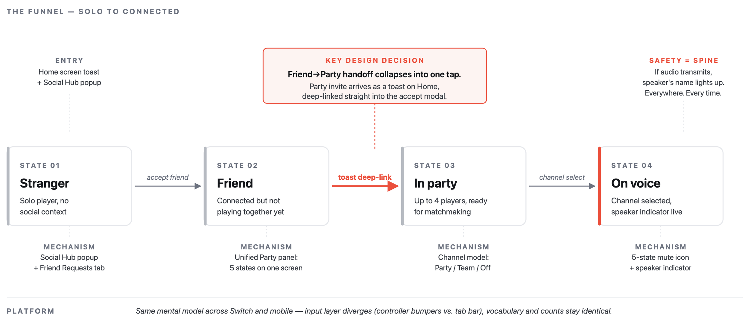
Stop designing features. Design the funnel.
The reframe was to treat stranger → friend → party → in-game voice as one journey, not three. Every handoff point was a potential drop-off point.
DECISION 01
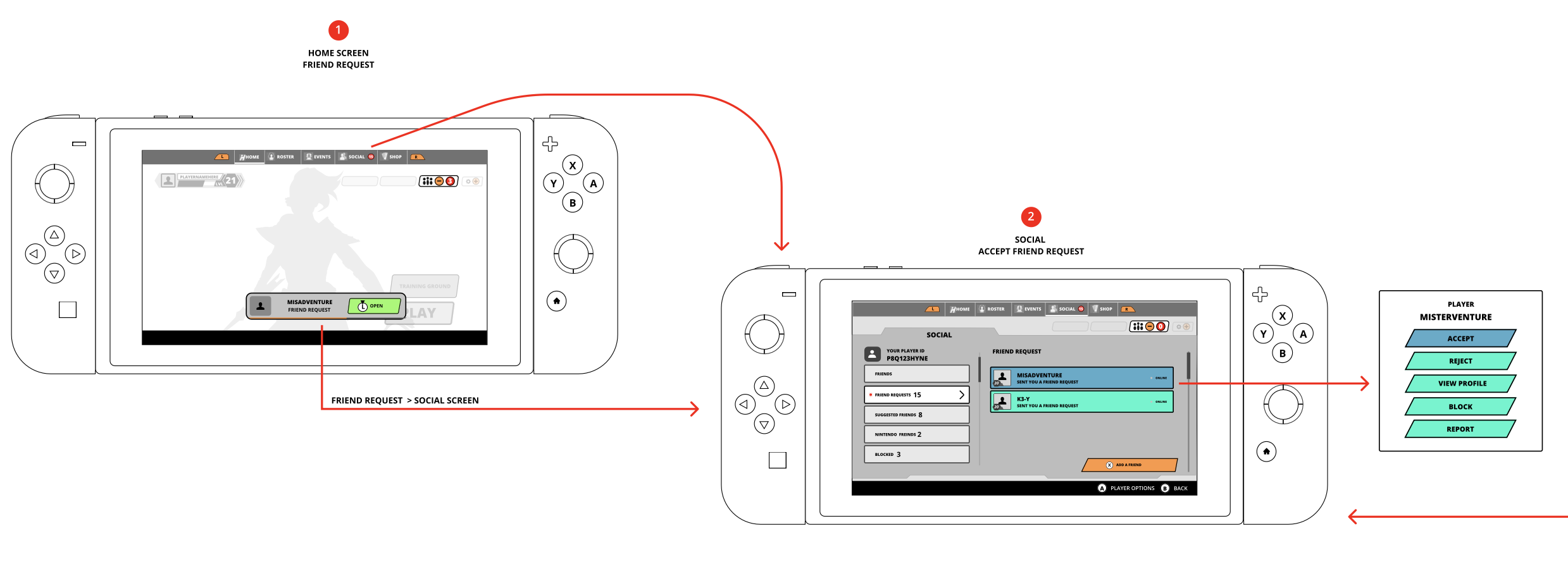
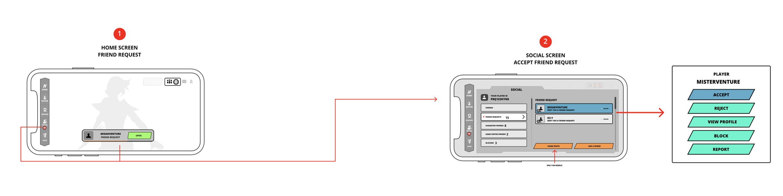
Collapse the friend-to-party handoff into a single tap
The highest-leverage moment in the whole system is the one right after a player accepts their first friend request. That's when they are most likely to actually use the social feature. Sending them back to a home screen to wait for a party invite — which they'd then have to hunt for in a menu — wastes the momentum.
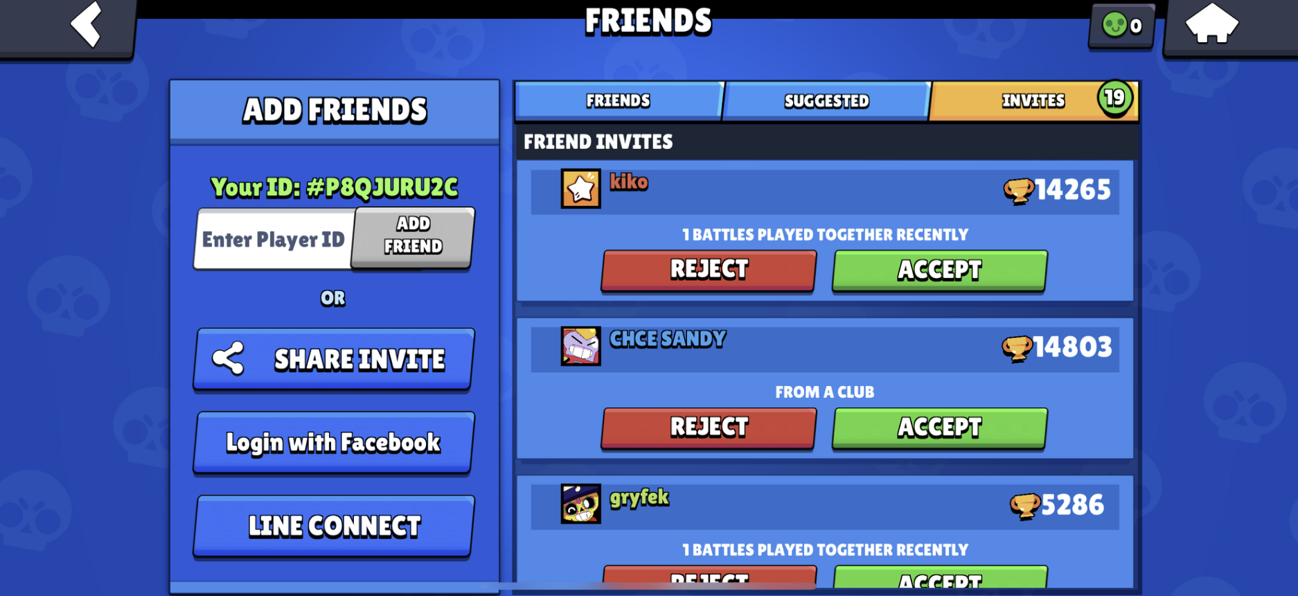
So the new friend's party invite arrives as a toast, on the home screen, deep-linked straight into the accept modal. Three frames, one hand, no hunting. The visual funnel below is the shipped flow on Switch.
A few small decisions inside that flow mattered more than they look: the toast is persistent long enough to catch, but times out so it doesn't become noise; the Social screen is always the fallback target if the toast is dismissed; and the accept modal uses the same button grammar (Accept / Reject / View Profile / Block / Report) as every other player-interaction surface in the game. Consistency here is a shortcut — players learn it once, everywhere.
DECISION 02
Same mental model, different input
Switch plays on a couch with a controller. Mobile plays on the bus with a thumb. A pure parity design would have forced touch-first layouts onto Switch or given mobile players buttons they couldn't reach. A pure divergence would have split the product in two twice the surface area, half the coherence.
The resolution was to hold the mental model constant same hub, same vocabulary, same funnel and let the input layer diverge only where it had to. Bumpers swap tabs on Switch; a tab bar does it on mobile. Push-to-talk exists on Switch and is removed on mobile. The counts on each tab are identical across platforms because that's the information architecture, not a platform detail.
The full flow is the hero image above. The comparison is deliberate: if you cover the device frame, the underlying UI is the same product.
DECISION 03
Delete the standalone mic button
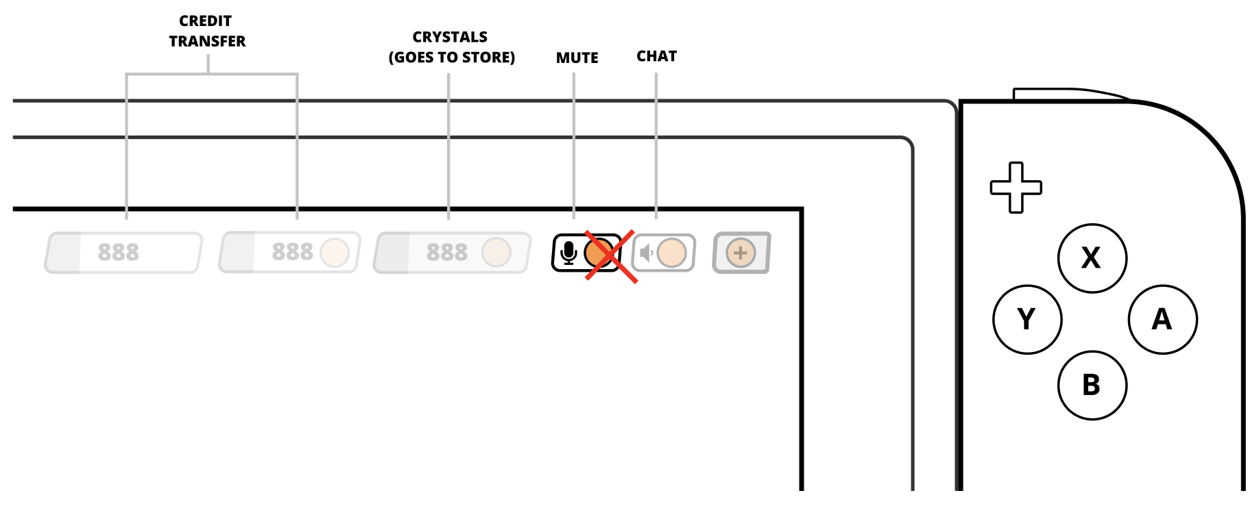
This is the decision I'm proudest of, because it's a deletion. The original mobile HUD had a dedicated mic button: tap to mute, hold for push-to-talk. It did two jobs badly it cluttered the combat UI, and it put voice controls in a place players didn't associate with "talking to friends." Voice lives next to friends, not next to the fire button.
All voice controls mute, volume, channel move into the Voice Chat section of Social. The combat HUD gets one fewer thing to think about; players get one obvious place to find anything voice-related.
Push-to-talk goes with it on mobile. On a touchscreen, a "hold" gesture during combat is a collision with every other on-screen action. Keeping PTT on Switch where there's a free bumper and dropping it on mobile is the kind of asymmetry the mental-model-first approach lets you make without guilt.

DECISION 04
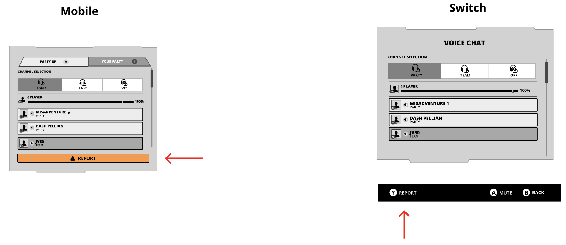
Voice as a channel model, not a mic icon
With the mic button gone, voice needed a new home with a clear mental model. The one that held up in every playtest was Party / Team / Off — three mutually exclusive channels the player is always on exactly one of. No hidden state. The Players List below the selector updates based on context: party only, team only, or party members above non-party teammates when both exist.
Voice chat as a spec, not a mic icon. Three channels, one players list, one clear active state. The mute icon alone has five states (muted / muted+disabled / unmuted+silent / unmuted+speaking / unmuted+distorted) — enough resolution to tell a player what's actually happening on the line.
HOME SCREEN

DECISION 05
Make safety the spine, not a feature
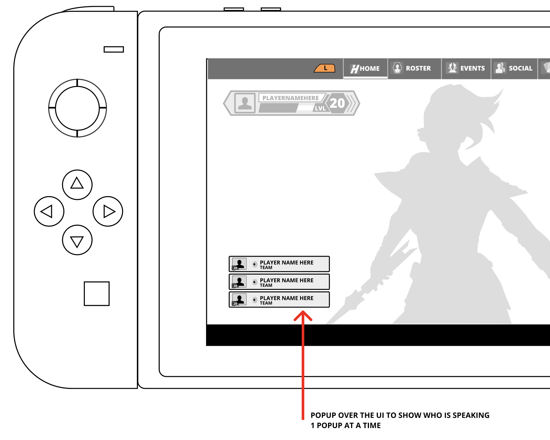
Voice chat in multiplayer is a safety surface. Harassment lives here, and a platform that can't showwho's talking can't be reported on. So we made speaker activity indication a hard, inviolable rule: if audio is transmitting, the speaker's name lights up everywhere, every time. That one constraint shaped the entire voice UI.
Speaker activity on home, in-game (floating UI), and in-world. There is intentionally no way to hear voice audio without seeing who it came from unless the player opts out in settings. Everything else the channel model, the mute states, the Report button on every player panel ladders up to this.
There was also other part of the game such as settings that was impacted/updated curing this process
What this project taught me
Three things, in the order they mattered.
The frame matters more than the features. The moment we stopped calling this "Friends & Parties & Voice" and started calling it the path from solo to connected, most of the decisions above wrote themselves. The specs we inherited treated the three as peers; they're actually a sequence.
Parity is a trap; the mental model isn't. Trying to make the Switch and mobile UIs look identical would have broken both of them. Trying to make them behave identically — same vocabulary, same counts, same next step s what let us diverge on input without fragmenting the product.
Safety belongs in the spine. The speaker activity rule didn't come from compliance compliance is what made it a requirement. But if we'd bolted it on at the end, the voice UI would look completely different, and worse. Letting the safety constraint shape the core voice model early gave us a cleaner system than any "add a report button later" retrofit would have.
What I'd change
If I ran this again, two things would change. First, I'd invest earlier in one-handed mobile playtests. The Social hub works well with a thumb, but "works well" isn't the same as "was designed for it." Second, I'd push harder on the empty states. When a new player has no friends yet, the panel currently falls back to Suggested Friends and Nintendo / Game Center friends which is fine, but it's a moment that could do real teaching work for the funnel, and we left that on the table.
From spec to shipped
The game launched as Star Wars: Hunters on June 4, 2024 across Switch, iOS, and Android. The information architecture from the spec — the Social screen with Add / Friends / Suggested / Invites / Blocked, the separate Party panel, the status vocabulary ("In Match / In Your Party / In Another Party") — is what actually shipped. The visual treatment went through a full refresh in the 0.19 update (January 2024), moving to a brighter blue palette, so the shipped UI looks different from the wireframes above, but the flows behave the same. Servers were shut down on October 1, 2025.
Full gameplay walkthrough (no commentary)
FAQ
-
Interaction design for the Social Hub popup, the Social screen, the Party panel, the Voice Chat tab, and the voice chat settings surface. I partnered closely with the PM on requirements and edge cases, the Design Ops lead on platform-specific behavior (Switch controller mappings, mobile touch targets), and the UI Art Lead on visual treatment.
-
The information architecture and flows shipped close to spec. The visual treatment was replaced in the 0.19 update with a brighter blue palette — that was an art-led decision that post-dated my spec, and it works better than the original grayscale wireframes here would suggest. Voice chat was cut before launch; the Switch doesn't support native in-app voice (Nintendo routes it through their separate app), which made cross-platform voice harder to ship than planned. The voice designs in this case study are the full spec, not the shipped surface.
-
Mixed. Some came from analytics on the previous mobile-only social flow (clear drop-off between friend-accept and party formation, which is what the toast deep-link was designed to fix). Some came from small-group playtests on the Party panel layout. The voice chat decisions — particularly the always-on speaker indicator — came from legal/policy requirements rather than research. I'd do more formal one-handed mobile testing if I ran this again.
-
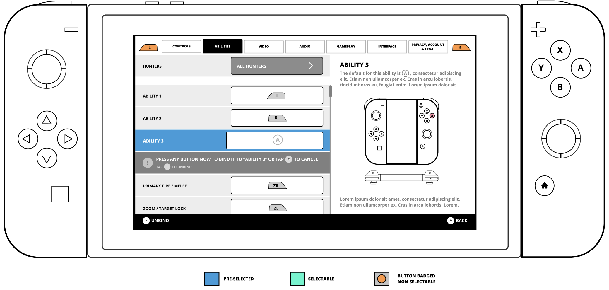
Bumpers (L/R) swap tabs in the Social hub. A confirms, B cancels, X is the primary contextual action (Add Friend / Leave Party / Open Social depending on context), Y is the secondary action (usually Player Options). Plus and Minus stay reserved for Nintendo system functions. Every interactive state was reachable without a pointer; we deliberately designed the information density so the D-pad could step through the list without feeling sluggish.
-
No. Zynga shut down the servers on October 1, 2025. The client still installs, but online features are offline. Screenshots and gameplay videos remain the only way to see the shipped UI now, which is why the "Where to see the shipped UI" section above links to captured sources rather than the live game.
Conclusion
IThe most valuable thing a UX lead can do is reframe the problem. We walked in with three disconnected backlogs and three deadlines. We walked out with one funnel — and every decision that followed fell out of that single reframe.
Cross-platform design fails when you optimise for parity and succeeds when you optimise for mental model. Players don't care that Switch uses a bumper and mobile uses a tab bar; they care that their friends list works the same way. Next time I'd close the measurement gap — quantitative targets on the funnel itself so the decisions get defended with numbers, not just logic.