How to speak Game Dev Without Writing Code or Losing Your Mind
I have had the pleasure of working with some amazing devs who are passionate about games and are great at collaboration. But designers and developers can some times speak different languages.
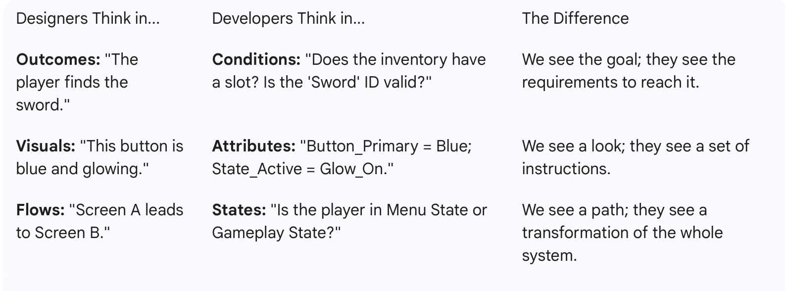
Devs approach a project by looking for the "Source of Truth." They hate repeating themselves. If you design five different pop-ups that all look slightly different, a dev sees five problems to solve. If you design one "Template" that changes content based on the situation, they see one solution.
Design for the system, not the screens. A screenshot is a moment in time; a system is a living thing. Think variables and logic instead of just pixels. While designers usually focus on the User Journey (how someone feels and moves) developers focus on Architecture (how the data lives and reacts).
Think in "States," Not Just Screens
Game devs don't see a "Menu Page." They see a collection of objects that are constantly changing. To work well with them, your HCD (Human-Centered Design) needs to account for States.
Instead of just showing a finished screen, show them:
The Idle State: What it looks like when nothing is happening.
The Active State: What happens when a player hovers or clicks?
The Loading State: What does the user see while the data is fetching?
By designing the logic of how a button behaves, you’re doing the heavy lifting for the dev. You are defining the "if this, then that" of the experience.
The Modular Mindset
Instead of designing a "Shop Screen," think of it as a Collection of Components.
The Designer View: "I’m drawing the shop."
The Dev View: "I'm building a 'Slot' component that I can repeat 50 times." If you design the "Slot" once and show how it scales, the developer can build it much faster and with fewer bugs.
Logic Over Layout
A dev's biggest question is always: "What happens if...?"
What happens if the player has 0 gold?
What happens if the item name is 50 characters long?
What happens if the internet cuts out?
When you design for the system, you provide answers to these questions before they even ask. You aren't just designing the "happy path"; you’re designing the guardrails for the engine.
🛠️ Simple Handoff Checklist
The "What If" States (Edge Cases)
Devs hate "magic" UI that only works in a perfect scenario. Show them you've thought about the broken parts.
Empty States: What does the inventory look like with zero items?
Max Capacity: What happens when a player has 9,999,999 gold? Does the text wrap, shrink, or truncate?
Loading & Latency: If the server is slow, what is the "shimmer" or "spinner" behavior?
The Logic of Movement (Transitions)
In a game, things don't just "appear." They animate in. But devs need to know the logic of that animation.
Trigger: What starts the move? (A click, a timer, or a game event?)
Interrupts: If I click "Close" while the menu is still opening, what happens? Does it snap shut or reverse the animation?
Direction: Does the panel slide from the left or scale from the center?
The "Single Source of Truth" (Tokens)
Instead of a style guide that says "use this blue," give them a list of functional names.
Action Color: Used for anything clickable.
Disabled Color: Used for anything locked.
Surface Color: Used for the background of panels.
Sticky Insight: If you change the "Action Color" token, it should update every button in the game automatically. That’s a system.
Responsive Rules (Layout Logic)
Games run on everything from massive ultrawide monitors to tiny phone screens.
Anchors: Is this mini-map stuck to the top-right corner, or does it stay a certain percentage away from the edge?
Scaling: Does the UI get bigger on a 4K screen, or does it just show more content?
Conclusion
Communication is the most important tool in your stack. You can have the best Figma plugins as a designer or coding skills as a dev, but the most powerful tool is simply understanding how a developer and other teams think. Build the bridge, and your design intent will follow.