The diegetic UI of Dead Space
UI is a double-edged sword, it can be the foundation of interactivity or a barrier to it. Players can spend more time in the game's menus and options than in the actual gameplay. Classic games such as Tetris and Pong are basically all UI. But as 3D animation came into play the UI was reduced to options and maps. Some modern games try to reduce UI, whereas some games use UI as a key part of the game, take for example Persona 5 where the UI is full of personality and an art style that reflects the world of the game.
The goal of good game UI is to be comprehensible and useful without getting in the way. Similar to a butler who is there only when you need him. But as games become more sophisticated there is a push away from UI. Some games have opted for environmental storytelling and inworld elements such as wind or checkpoints to replace a lot of the work the UI used to do. Take Ghost of Tsushima for example, where the indicator of your life is displayed only when the sword is extended because it is only needed during combat, but is useless when exploring the island. This is a design choice that makes the game look more cinematic and Immersive.
Another solution is to make the HUD elements diegetic. This means that the UI physically exists within the game world itself. The most famous use is, of course, in the game Dead Space by Visceral Games.
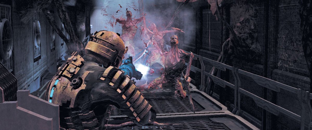
Dead Space is a third-person, sci-fi horror game where you play as Isaac Clark an engineer stuck on The Ishimuram, a ship infested with zombies. Your job is to fix that vessel and find your girlfriend. To maximize the playing horror experience, designers focused on sounds of a broken creaking ship, flickering lights and holograms, cinematic camera angles and sound effects and even loading screens and saving points are part of the game world.
A fully Diegetic UI

Isaac Clark’s personal UI exists as a real-world element. In the space horror atmosphere, the use of a diegetic in world UI that does not pause the game makes sense and adds to the user experience. The Isaak’s health and stasis meters which would normally be on the bottom left or right of the screen was included in Isaak’s suit as it is always visible.
Dead Space also uses the plot device of futuristic holographic projections similar to other sci-fi movies and games to be able to put the UI elements in the world. Unfortunately, this use of light blue holographic UI art style can be a nightmare for visual accessibility. made it more convenient to navigate the game, especially when maps aren't text-heavy and are easily accessible. For example, a map can be accessed by walking up to it and seeing where you are and what it contains. The visual experience is also commendable considering that all you have to do is press a button, and the camera would zoom past Isaac and take you towards the next level in the form of a tram ride.
What makes this move commendable is that it retains a player's attention span and "tricks" them into thinking that it's just part of the game when in reality, they're moving towards the next level.
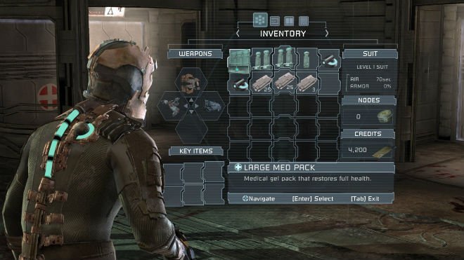
The devs had put the UI a meter and a half above the ground plane at all times because it was important for them to make sure that you could see what you were dealing with. This was a lesson learned especially once they realized that putting the UI too high or too low tends to create discomfort or confusion on
Dead Space’s UI strategy has been very influential in the games industry and there are many developers taking note. Whether your UI is meant to be the main part of your game or a minimalised dietetic UI like Dead Space, the investment and consideration for crafting better interfaces can only help users get b better gaming experiences.
If you want to know more about the UI in Dead Space check out the GDC talk below.