Why Your UX Director is Wrong About Diegetic UI
The Shenmue Tax: My First UX Nightmare
In 1999, I played Shenmue on the Dreamcast (Guess I’m old), and it changed how I viewed design forever—but not for the reason the developers intended.
Yu Suzuki wanted "Total Realism." He gave the protagonist, Ryo Hazuki, a mandatory curfew. No matter how deep I was into a story beat or how close I was to mastering a new combat move, at 11:30 PM, the game effectively stopped. I had to physically run Ryo all the way back across town to the Hazuki residence just to sleep. If I didn't, the screen would fade to black and force me there anyway.
Some times everyone wants 'Dead Space' style diegetic UI because it looks cool in a portfolio. But for 90% of games, diegetic UI is a retention killer. It adds cognitive load, slows down the player, and increases 'Time to Fun.
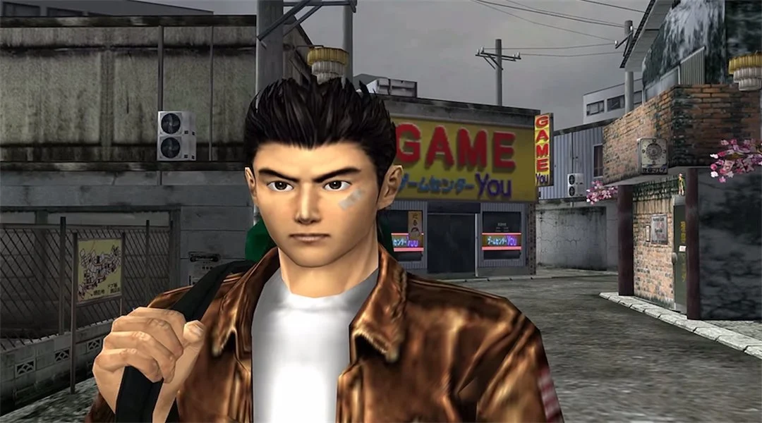
The designers thought they were creating "immersion." What they actually created was a tax on my time. I wasn't feeling like a martial artist in Japan; I was feeling like a frustrated consumer watching my limited Saturday afternoon disappear into a virtual commute.
Any "realistic" feature that forces a player to perform a chore instead of playing the game.
Why "Designing for Designers" is Killing Your Retention
As much as I love games like Dead Space I worry when other designers get obsessed with making UI "diegetic" meaning the interface exists within the world (like a character looking at a physical map). as if it will win them awards at GDC.
They are designing for other designers, not for players.
When you prioritize "Diegetic Immersion" over "Functional Utility," you are actively burning your studio’s money. Here is why:
The Squint Factor (Cognitive Load): If a player has to stop and rotate their camera or wait for a "look at watch" animation just to see their health while being shot, they aren't "immersed." They are stressed. And not the good "gameplay stress" the "this boring" stress.
The Animation Tax: Opening a physical map in-game takes 1.5 seconds. A screen-space HUD map takes 0 seconds. Over a 40-hour AAA RPG, that 1.5-second delay happens thousands of times. You are essentially forcing your players to watch a "loading bar" made of hand animations.
The Ego Gap: UX Directors want to be "innovative." But players want to be "competent." If your UI is so "clever" that the player feels incompetent because they can't find the exit, they will close your game and open one that respects their time.
Verdict: As much as I love though proving cool UI, If it doesn't make the player faster, better, or more powerful, it’s fluff. Stop trying to be "realistic" if it dose not make sense and value players time.