Building a Visually Game Identity with Art Direction and UI design
As a UX/UI designer in AAA game development, our roles includes understanding and crafting interfaces that align with the game's themes, narrative and art direction. The UI is the first things players will see so it needs to set the tone for the rest of the game.
AAA menus should use the art direction and themes as the game itself. If your game is a gritty medieval RPG, your menus should bring that to life maybe by using heavy parchment payer and cold iron.
Why? This maintains Cognitive Flow. The brain stays in "game mode," making it much harder for the player to decide to put the controller down.
Here are some examples of my favourites.
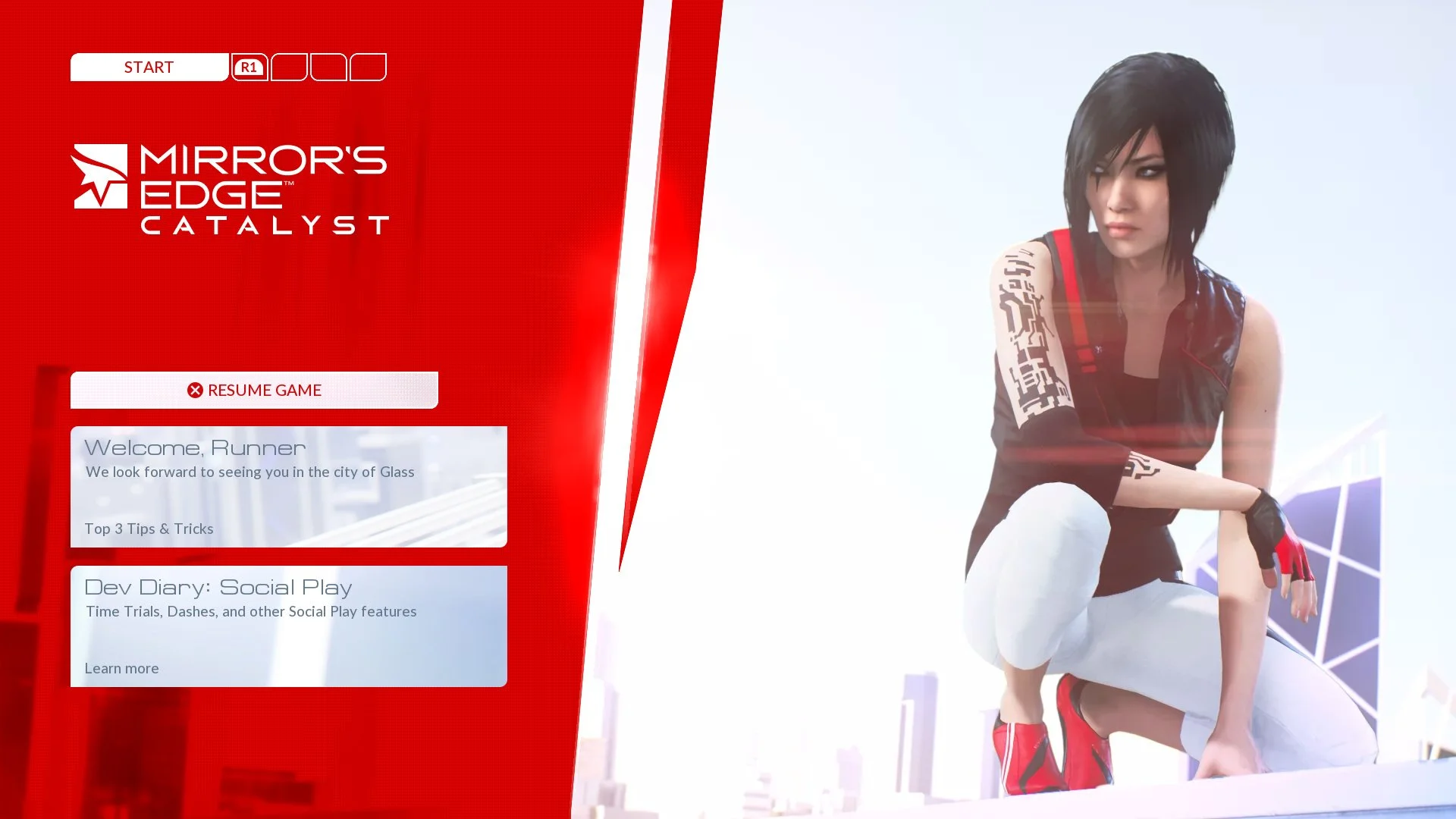
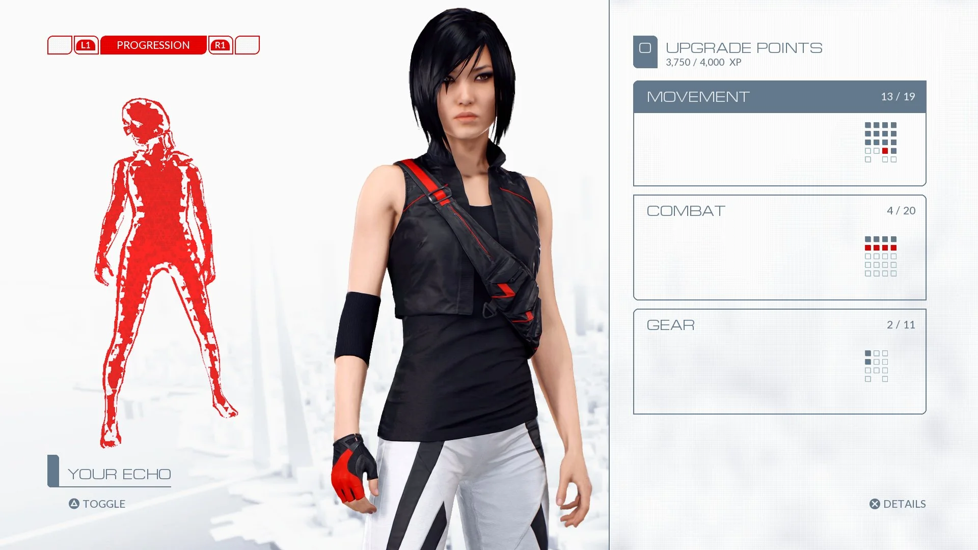
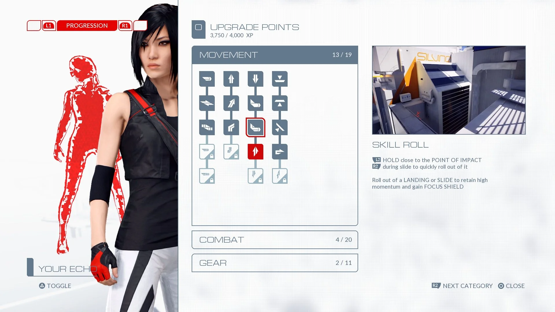

Mirror’s Edge: The Minimalist Urban Runner
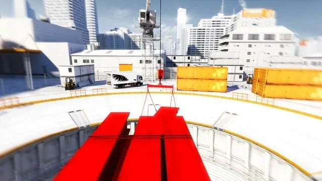
Mirror’s Edge’s clean futuristic UI matches the game world by becoming invisible, except when it physically paints itself onto buildings (Runner Vision) or when the city's cold, authoritarian voice takes over (menus and typography). The UI isn't a layer on top of the experience; it's woven into the act of running.
Diegetic Minimalism: There is no traditional HUD. Sprint speed is shown by vignette and wind noise, runner’s vision floods pathways in bright red, and momentum is felt through the environment, not meters.
High-Contrast Palette: Stark whites, deep blues, and vivid signal reds create a sterile yet urgent visual language, reflecting the city’s oppressive order and the protagonist’s defiant energy.
Sans-Serif Precision: Menus and mission text use razor-sharp, geometric sans-serif fonts that feel corporate and clinical — a direct contrast to the messy, human act of running across rooftops.
Every UI choice in Mirror’s Edge erases itself from conscious thought, pushing the player to read the world directly rather than through on-screen overlays.


Red Dead Redemption 2: The Rustic Old West
Red Dead Redemption 2’s UI exemplifies how subtlety can amplify immersion. Its design mirrors the game’s sprawling, romanticized depiction of the American frontier:
Hand-Drawn Aesthetic: The map and menus use textures that mimic parchment and pencil sketches, evoking an era before industrial printing.
Sepia Tones: A warm, aged color palette reinforces the Old West’s nostalgic feel.
Vintage Typography: Fonts inspired by old wanted posters and store signs ground the player in the period.
Every design choice in the UI helps bridge the player’s modern experience with the historical setting of the game.


BioShock: Art Deco Dystopia
BioShock’s UI is a masterclass in thematic consistency. Set in the underwater city of Rapture, a fallen utopia from the 1940s, the game employs an Art Deco aesthetic throughout its design. The UI mirrors this style with:
Geometric Patterns and Ornate Borders: Menus and health meters are framed with intricate designs reminiscent of 1920s and 30s architecture.
Typography: Bold, capitalized fonts evoke a sense of industrial grandeur, aligning with the game’s themes of ambition and hubris.
Muted Gold and Green Tones: These colors, characteristic of Art Deco, add a sense of opulence tinged with decay, mirroring Rapture’s descent into chaos.
By keeping the UI within the world’s aesthetic it helps players be immersed into its retro futuristic atmosphere.

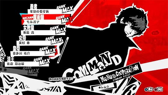
Persona 5: Pop Art Rebellion
Persona 5’s UI is as dynamic and energetic as the game itself. Its bold, stylish menus reflect the rebellious spirit of the characters and their fight against societal corruption:
Pop Art Influence: Menus burst with bright colors, sharp angles, and halftone patterns, reminiscent of comic books and street art.
Dynamic Animations: Transitions between menus are fluid and exaggerated, reinforcing the sense of action and flair.
Layered Typography: Fonts are bold, varied, and often overlap, mirroring the chaotic yet focused mindset of the protagonists.
Persona 5’s UI doesn’t just serve functionality; it’s a visual extension of the game’s identity.

Nier: Automata: Digital existentialism
In Nier: Automata, the UI blurs the line between gameplay and narrative. It’s designed to reflect the perspective of the android protagonists:
Glitch Effects: Menus and overlays occasionally “glitch,” reminding players they’re navigating a digital reality.
Minimalistic Design: The sparse UI mirrors the game’s themes of existential emptiness and the androids’ utilitarian nature.
Diegetic Elements: Settings and inventory appear as part of the characters’ internal systems, reinforcing immersion.
This approach turns the UI into a narrative tool, deepening the connection between the player and the androids.

Cuphead: Vintage Charm of the 1930s
Cuphead’s UI is an integral part of its homage to 1930s cartoons. Every element reinforces its period accurate art direction:
Hand-Drawn Menus: UI elements look like they were inked and painted by hand, mirroring the game’s visual style.
Era-Appropriate Fonts: Rounded, playful typography evokes the cheerful, bouncy tone of early animations.
Simple Layouts: The UI is straightforward, reflecting the minimalist interfaces of early arcade games.
The result is a seamless integration of UI and game world, preserving the illusion of stepping into a vintage cartoon.


Dishonored: Industrial Steampunk
Dishonored’s UI complements its steampunk world of Dunwall, a city teetering between industrial progress and decay:
Mechanical Motifs: Gear-like elements and intricate borders decorate menus and HUDs.
Muted Colors: A palette of browns, grays, and deep blues echoes the grimy, industrial aesthetic.
Ornate Typography: Fonts inspired by Victorian era posters tie the UI to the setting’s historical influences.
The UI’s intricate design immerses players in the gritty, morally ambiguous world of Dishonored.


Alien Isolation: Retro 70s Futurism
Alien: Isolation’s UI faithfully recreates the look and feel of the 1979 film, heightening the tension and authenticity:
CRT Aesthetic: The UI mimics outdated monitors with low resolution text, scanlines, and flickering effects.
Analog Design: Switches, knobs, and dials in the menus reflect the tactile technology of the film’s universe.
Muted Color Scheme: Greens and grays dominate, mirroring the utilitarian design of the Nostromo spaceship.
This approach not only grounds players in the world but also amplifies the horror by immersing them in its analog claustrophobia.


Assassin’s Creed Origins
Assassin’s Creed Origins transports players to ancient Egypt, and its UI mirrors the setting’s historical richness:
Hieroglyphic Motifs: Menus incorporate symbols and designs inspired by Egyptian art.
Earthy Tones: Golds, sands, and browns dominate the palette, reflecting the desert landscape.
Minimalistic, Historical Fonts: Typography evokes an ancient yet approachable feel, blending history with modern usability.
The UI acts as a bridge between the modern player and the ancient world, enhancing immersion while maintaining clarity.
Conclusion
Thematic UI is more than just an aesthetic choice; it’s a storytelling tool. By aligning the UI with the game’s world, we can create a cohesive experience that keeps players immersed. Every detail—no matter how small—can contribute to a richer, more engaging experience.