How to overcome choice paradox
At its core, UX design is about solving problems. And yet, when it comes to designing user interfaces, we often face a dilemma: too many choices can paralyze the user, but too few can leave them feeling unfulfilled. How do we find the right balance?


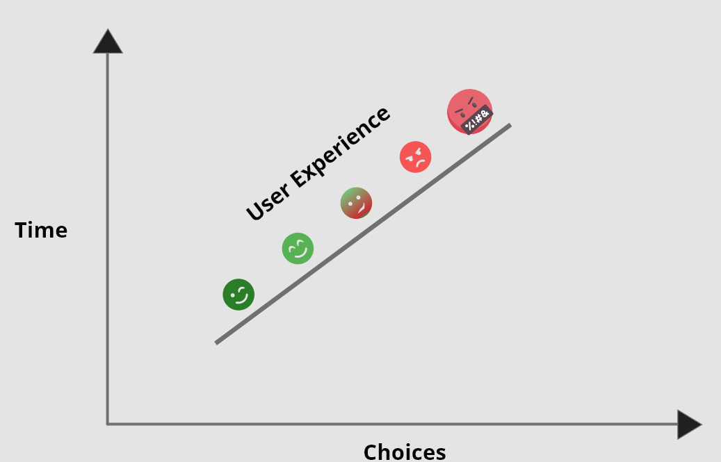
Hick's Law (Hick-Hyman Law) states that “The time it takes to make a decision increases with the number and complexity of choices”
What is the paradox of choice?
The paradox of choice is the psychological phenomenon where people have difficulty making decisions when they are presented with too many options. This can lead to feeling overwhelmed and stressed, and can even cause people to avoid making decisions altogether. It’s like we have a limited pool of mental resources that get drained during the day resulting in decision fatigue.
When it comes to UI/UX design, the paradox of choice can be a major obstacle to creating effective and user-friendly designs. Too many options can make it hard for users to find what they're looking for, or to even know where to start. It's important to strike the right balance between giving users enough options to meet their needs, without overwhelming them.
There are a few ways to overcome the paradox of choice in UI/UX design:
Keep the design simple and uncluttered from the start.
Group similar options together. This make it easier for users to compare options side by side and also helps to reduce cognitive load..
Use clear and concise labels. This will help users understand what each option is and what it does, making it easier to make a decision.
Allow users to filter and customize or save their favourites. This gives them more control.
Consider the user's needs and goals. What are they trying to accomplish? What do they need from your design?
Understand the user’s cognitive load and mental state during each step.
Be aware of the trade-offs involved in every decision. There is always a trade-off when designing anything, whether it's between usability and aesthetics or between different ways of accomplishing the same goal.
Leverage personalisation or recommendation systems. This will make decisions faster and make things more personal to the user.
Use progressive disclosure to gradually reveal options as needed. This technique is often used in wizards or forms, where advanced options are only shown after the user has completed the basic fields.
Provide default selections. When possible, pre-select the option that is most likely to be desired by the user. This not only saves time but can also nudge users towards making the best choice.
Use search and filtering features. If there are too many options to reasonably display on one page, provide search and filtering capabilities so that users can quickly find the specific option they're looking for.
Help users make decisions by providing them with additional information and tips about each option.
Be careful to not oversimplify to the point of creating more frustration.


This all suggests that people are happier when they have fewer choices to make. In other words, too many choices can lead to anxiety and indecision.
This theory can be applied to UI/UX designers who should work to help users by giving them a few clear choices and more meaningful that will help them accomplish their goals quicker.
One way to fight the paradox of choice is to use default values and pre-selected options that users see when they first interact with a product. For example, when you create a new account on a website, the default values for your profile settings might be your name, gender, and location prefilled. Help reduce the number of choices users have to make.
using Psychology Principles to sweet spot

A good idea for the number of options or choices is somewhere between 5 and 9 items but this could depend of the situation and goal of the user. A study by researchers at Stanford University found that the ideal number of choices for a UI or UX design is between 10 and 20. This sweet spot allows for a good variety of options without overwhelming the user.
So if you're designing a UI or UX, aim for 10-20 choices. This will give your users just enough options to find what they're looking for without feeling overwhelmed.
Conclusion
The paradox of choice can be a real problem when it comes to UI UX design. However, there are ways to overcome it. By understanding the psychology behind why we have trouble making decisions, we can design better interfaces that help users make the choices they need to without feeling overwhelmed. With a little thought and effort, we can help our users find the perfect solution for their needs without them even realizing it.