Navigation UX: Cyberpunk 2077
I recently revisited Cyberpunk 2077 on PC and I can say that it’s in a much better place than when it launched. However, during my play, there were a number of UX and UI inconsistencies that I noticed. And this goes to show how complex it is to make AAA games even with all CDPR’s past experience of making ground-breaking open-world RPGs. A great user experience should be like a butler, only there when you need it. But unfortunately, when it goes wrong, it really stands out.
There are many things we can learn from Cyberpunk 2077, including user experience. There are many areas of the game that I could talk about but I think a good place to start with any game or digital product is core navigation. As games get more and more complex, more players will be spending on menus and settings.
The menu is very cluttered and overwhelming. It is difficult to find what you are looking for, and it can be easy to accidentally select the wrong option. This can lead to a lot of wasted time and frustration. There are a few ways to fix this problem. First, developers need to focus on making the main menu design as clean and simple as possible. Second, they need to make sure that all of the game's menus are easy to understand and use. Third, developers need to provide clear and concise instructions on how to use the game's menus. Players should never feel lost or confused when they are trying to navigate the game's menus.
RELATED POSTS: THE PROS AND CONS OF DESTINY'S FREE-FLOATING CURSOR MENUS
Main Menu

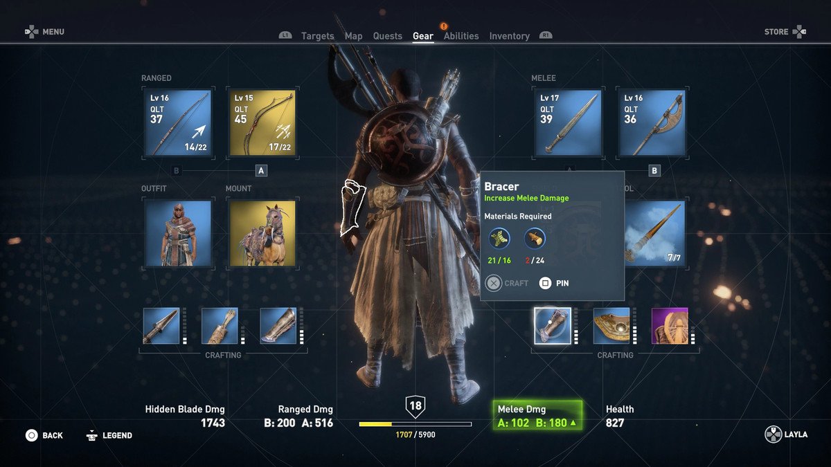
When you tap the main menu button you come to this screen with a list of options to hover over, which then reveal a number of other options. Hover interactions are not that great because you have to remember what is under each option or you have to manually navigate to it to see what was under there. This break the rules of recognition over recall. It forces you to remember options when it could just show them to you upfront. They could have turned these options into bigger thumbnails with information about each area or status update. The journal could show info about your Current quest. There is also a lot of wasted space, this screen did not need to cover the whole screen. Maybe they could have had this menu off to one side similar to Remnant From the Ashes.
In my opinion, this for me is a screen that offers little and should be skipped and opened up directly into one of the options. means you have to always navigate to these options using the virtual cursor when if you allowed players to open into the map or inventory screen as in other games such as AS Origins or Remnant From the Ashes.
Visual accessibility

A constant problem with Cyberpunk 2077’s whole menu is its lack of contrast due to its red text on red backgrounds. You can have a visually consistent theme with your game but also make it readable for people with visual barriers. NieR: Automata by PlatinumGames is a game with similar themes of robots and AI, but has clear and easy-to-use menus. And it has also been praised by both fans and critics for its visually consistent menu design.
Top navigation

This is an area that has a lot of issues and one of the biggest is that it’s very inconsistent. As you can see here that there is some misalignment text and its not intuitive to know where you are in the submenus architecture just by looking at the top menu.
Shifting menu items

A tab navigation should show your currently selected item by highlighting it for you, not by moving it to the middle of the screen. This shifting structure can be very confusing and frustrating. As you are trying to build a mental model of your core navigation tabs only for them to change every time you select something. This can be very demanding on user’s cogintive attention.
Google’s Material Design has some good example of how best to use tab manivgation items. https://material.io/components/tabs#behavior
Duplicate menu items

Duplicate items are unnecessary and confusing to players and should be avoided. This proberbly comes from a need to have the selected item in the middle of the list and not to the left of the right of it.
Here is another good example from Remnant from the Ashes. You can see the top-level navigation is currently selected on Options and all the ones below its. Both levels are navigable using the mapped buttons. It’s a simpler and cleaner way to do it.
Sub menus

Another navigation issue you will see is the confusing sub menu layouts and structure. There already some good ways of showing users a secondary level of navigation.


Heroes of the storm
Tech trees
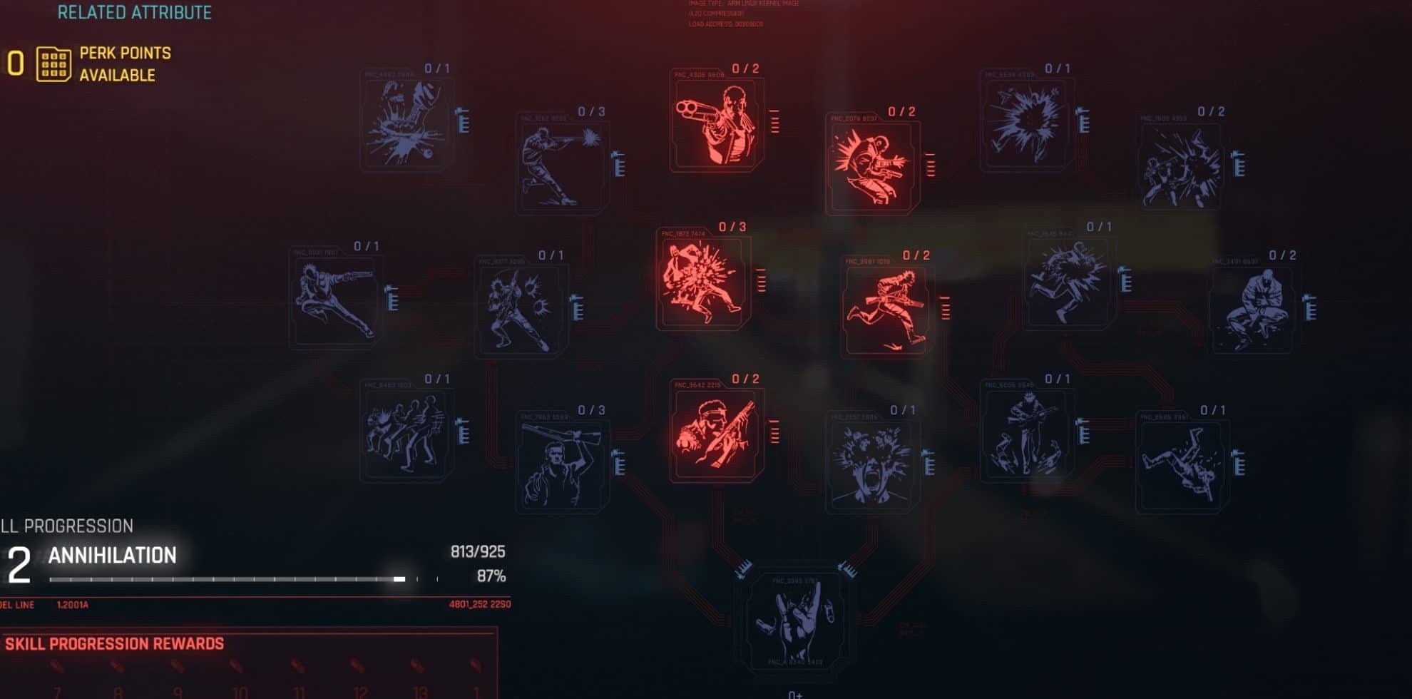

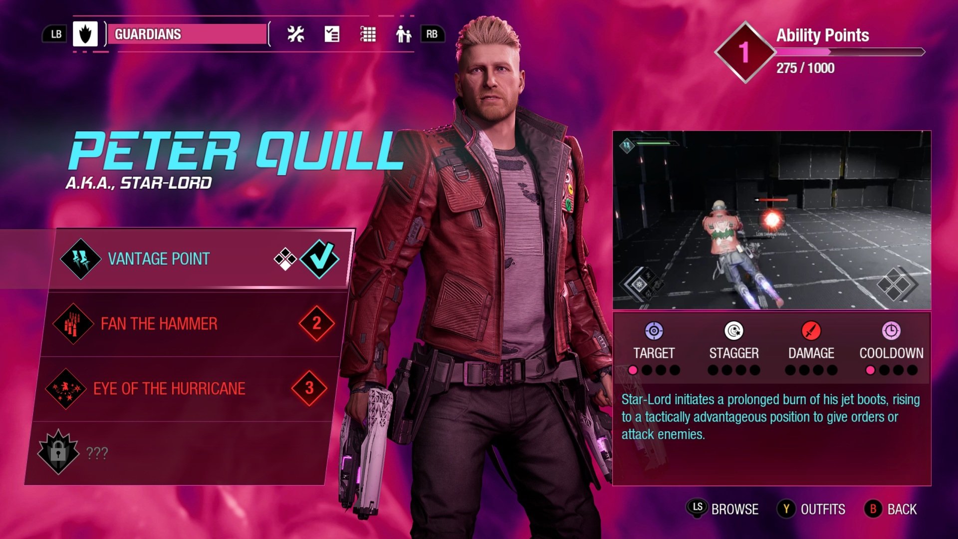
Another key area is the skills tree and there are many of them. These screens have many of the same issues listed above such as low visual contrast. Overwatch 2 in the second thumbnail shows a cleaner way of displaying multiple related skill trees. Unfortunately, this layout probably won’t work due to Cyberpunks 2077’s core interaction of hovering over items.
Conclusion
It's safe to say that Cyberpunk 2077 has not had the smoothest of launches. From widespread bugs and glitches to poor performance on last-gen consoles, to a confusing and convoluted main menu design, the game has been plagued with problems since day one. While some of these issues can be fixed with patches and updates, others are more systemic and will take longer to address. In the meantime, we hope CD Projekt Red can get the game up to par so that everyone can enjoy what is otherwise a fantastic game.