Mobile UX: Designing for Thumbs
Smartphones have become indispensable in our daily lives. But they are not just smart companion devices, they are also tactile playthings that we use as extensions of ourselves. Although now a mature platform there are still billions of people who are still to experience life with a smartphone. Smartphone usage is estimated to increase and hit 4.3 billion by (2023) with a possible eight billion people by then. So it is important for mobile designers to understand the intricacies and ergonomics of designing for that many thumbs.
Shifting paradimes
When new technologies emerge they are often built using the paradimes of the past. But this slowly changes as the new platform is understood better. When websites emerged the language used was that of newspapers. The use of grids, top area headers and navigation and an emphasis on being above the fold. But as things matures websites designers developers its paradimes. Especilly with the emergence of rich interactions, video responsive website design.
The same is true for apps. When apps became popular the exsisting paradime was that of websites. Having the navigation at the top complex forms and interactions that where designed for a keybaord and mouse.

How users hold their devices
The way users hold their device will determine what areas of the screen are easier or harder to interact with. Most research shows that most people whole their phones with one hand

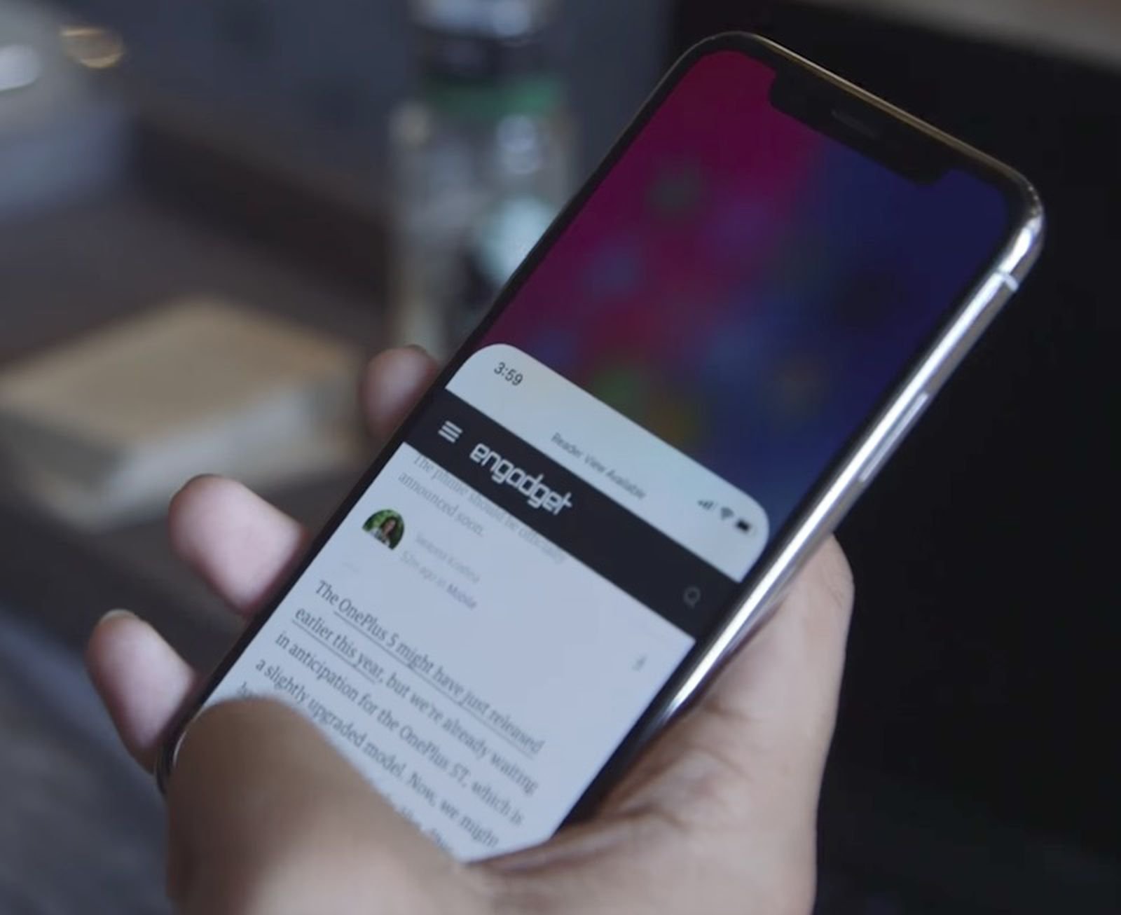
Time on Device
Smartphones account for 70 percent of the total digital media time in the US (Comscore, 2019). Smartphones are used in short frequent bursts ranging from a few seconds to around 5 minutes. With such short session lengths and high potential distractions as users often multi-task whilst on their phones. It’s can be challenging for designers to craft an intuitive friction-free experience that is consistent and delightful. Developers should aim for quick simple interactions that don’t require much mental or ergonomic effort. Designers should not assume that everyone pays attention as they use their smartphones. Our brains are very good at. trying to save energy by go with what it already knows.

https://www.lukew.com
Native design?
It can be so frustrating to learn new interactions for every app. So user’s existing understanding of mental models is important. This is where developers and designers can use the resources such as Material Design and Apple’s Human Interface Guidelines that come into play. These resources will help your product to be native to its respective platform.
Google’s own Youtube app has changed over the years to be more ergonomic by bringing key interactions to the bottom of the screen. Resembling the iOS standard tab navigation. A victory for what users need over what designers wanted to do and a sign of convergence as Material Design matures.

https://www.lukew.com/resources/mobile_first.asp
Reachability
As apps like Youtube change and adapt to be more ergonomic. You can. see. pattern emerging. On the old Android version you can see that the main navigation was in the higher tertiary position. As smartphones get bigger and bigger both Samsung and Apple have introduced a number to native eatures designed to tackle the reachability area problem that might also be coursed from poorly designed apps. Apple may have atural Its a natural gesture of pulling something down.

https://www.uxmatters.com/mt/archives/2017/03/design-for-fingers-touch-and-people-part-1.php
Giving users control
Apple updated safari to be more reachable by moving the address bar and main control to the bottom of the screen. They have also changed thalso give users control in settings where users can go back to the older layout. This is something we will see more and more of.

Gesture
Although Apple uses gestures, they offer deep and robust assessability settings. Generally, it’s a good idea to avoid Unessasery gestures as they can be hard to perform and inaccessible to some users. If possible you should offer gestures if needed as well as the option to turn them off.

Conclusion
Mobile devices are getting bigger and more complicated. But there is a lot of good information out there and it’s no longer the wild west. This also means that users have developed expectations and mental models of how things should work. The best way to validate your design is by getting it into users’ hands. It should also be noted that voice and 3D are also another new paradigms that will slowly mature and build on the learnings of the smartphone boom.