The pros and cons of Destiny's free-floating cursor menus
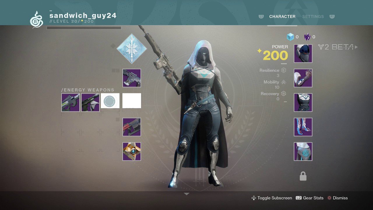
Destiny launched in September 2014 with a sleek, modern UI with a minimalist visual style. Early in the development, the designers opted for a floating free cursor as the main user input. By choosing to utilize a free cursor, Destiny's menus are allowed to feature freely placed elements of different sizes.
Innovative at the time, but not without its opponents. Even today, 8 years after Destiny's initial release, you'll see the occasional thread or online comment about how "awkward" the free cursor makes menu navigation. Console menus should be optimized for console controls, these critics claim, and the "PC-optimized" floating cursor used by Destiny is difficult to use with a controller. Or so they say.
Utilizing a floating free cursor comes with a set of pros and cons. Let's break down some of these pros and cons so that you can better understand when utilizing a floating cursor is a good idea for a game's menus.
Pros:
Design Freedom
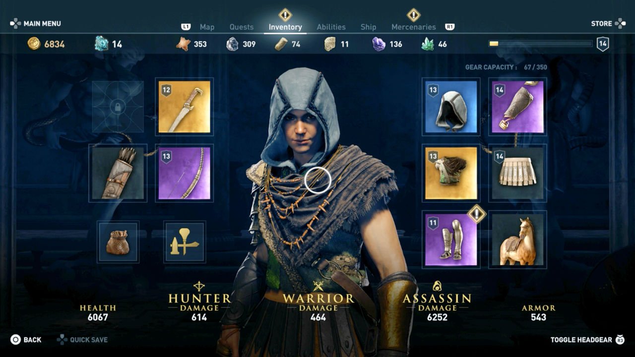
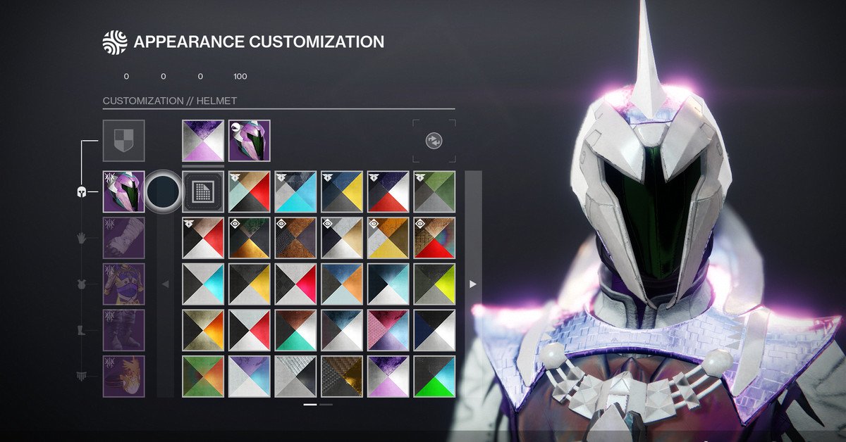
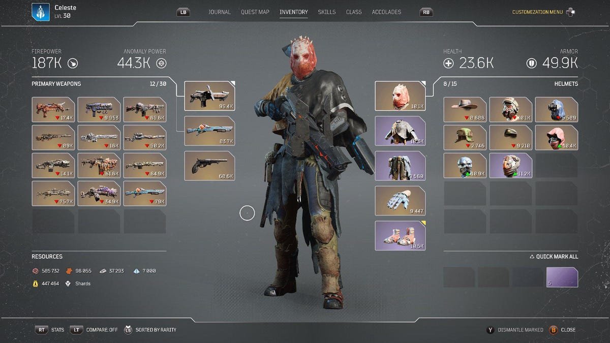
The biggest advantage of utilizing a floating free cursor is the ability to place elements wherever you want on the screen. With traditional controller-based UX, players utilize a d-pad style selection focus point that moves between elements one at a time. Each tap can only come in one of eight directions: up, down, left, right, or a diagonal in between. This works great when you've got a unified grid of even elements, as taps are predictable and responsive.
But when you start having elements of different sizes scattered throughout the screen, or even big gaps, users can find it hard to predict which direction they should tap to get to a specific menu element. Utilizing a floating cursor helps to nullify a lot of these problems.
Displaying Information
Tap-based menus can be quite limited in terms of space when it comes to the display of information. Normally you have to tap into elements to bring up information on a popup or another screen. A free cursor gives designers a hover layer on top of the screen with space for as many words or pictures as they need. t
Grouping elements
The ability to place UI elements freely means you can put any combination of elements anywhere on the screen. This allows you to convey space and scale, by putting different destinations far away on a map, or to convey that things are related, by putting options regarding the player's weapon in a cluster around an image of a gun. The freedom designers have in terms of size, shape, and distance can convey information about elements and how they relate to each other.
Thumbstick Aiming
Being a first-person shooter, it’s important that users are able to use a thumbstick as a core interaction of the game world. The use of analogue sticks allows users to move the cursor in shallow and steep angles, arcs, and circles with ease. Which are skills they will be using in the game world when aiming and selecting objects. So free-floating cursor is relevant to the core gameplay interactions that users will be performing.
Lessbutton to map to UI
By using the cursor users have only to aim at what they want and select. So there is a fewer UI element mapped to controller buttons to memorize. It also means Devs won’t need to worry about running out of buttons to map to UI elements.
Cons:
Covering the screen
There are many drawbacks to hover interactions. When using a hovering popup it is important to make sure that it does not cover relevant information. Also hovering is not something that can be done on a touch screen. Also, You can only hover over one thing at a time.
Visual Scanability
Using a hover means users can not scan something unless they go to it and hover over it. That is if they know that they need to hover over it in the first place. Signalling what is shows move info on hover and what does not can be another complication. For users, out of sight out of mind. Recognition is always better then recall.
Testing and Tweaking
Many of the obvious cons of free-floating cursor menus, like accidental activations, fine motor control impairments, and accidental deactivation are largely solvable with time, testing, and tweaking. Unfortunately, this means that you'll have to spend a lot of time, testing, and tweaking to get your menus right. Bungie, the developer of Destiny, has been very public about how their UI is the result of a lot of developer time.
Accessibility & Slower Menu Navigation
It should be considered that not all users can expertly manipulate thumbstick controls due to assessability barriers. So it is important to look at the speed of the curser and to make UI targets big and clear and many even attract the cursor like a magnet. This can take a lot of testing and tweaking.
Scalability
With the rapid emergence of new platforms and paradigms, such as AR, VR and the metaverse, developers have to think ahead to what core interaction and navigation patterns will scale well for the future. A free cursor might be PC native and console friendly but it might not scale well and then you will have the manga and maintain multiple core nivation patterns.


Should More Games Use Destiny's Free Cursor Menus?
Destiny resides in a very unique space in terms of control. Destiny's is a first-person shooter and it requires players to precisely manipulate the position of their cursor with an analog stick in the gameplay and in the menus. For this reason, the game is especially well suited to employ a free cursor menu for UI navigation. This can be very difficult for those with motor accessibility issues but the devs are experts in tweaking the way their game reads controller input to help players hit their targets, from elements moving closer to the cursor like a magnet and minimalist layout.
While Destiny's free cursor menus work great for Destiny, they might not work well for every game. Not every studio has Bungie's budget, Bungie's background in designing auto-aim systems, or Destiny's aim-focused player base. Without these elements, a free cursor menu won't have the same set of unique contextual advantages in other games.
This doesn't mean that free cursor menus are bad for controller-based games, but rather that they should be one of several options that developers should consider. A well-implemented free cursor menu offers freedom in terms of UI design, the display of information, and the grouping of elements. It keeps menu times even across beginner, intermediate and advanced players, and it requires lots of testing and iteration to get right. High-budget AAA games can be influential, it may not be wise to copy such a core interaction design if your game is not suited to it. Developers should always prioritise usability and accessibility.
Bonus
Here is a video about the fantastic work done by Apple on the iPad pointer. This video will show you how much thought went into bridging a pointer interaction into a touch-based operating system.
