AAA HUD Design Best Practices: From Health Bars to Quest Logs
HUD is short for heads-up display which is the UI that transmits information visually to the player during the gameplay. Consisting of diegetic and non-diegetic UI elements that give players information on things like health status, weapons & ammo, waypoints, mini maps and more.
Many games allow you to customise your HUD experience via the settings, to turn off or change your HUD elements. They may even have presets such as hardcore (No HUD) settings or streamer modes. In this post, I will be looking at some console and PC games that have good notable HUD designs, as well as some innovative ways of incorporating it into your game design itself.
common HUD elements
1. Health – The player’s health should be prominently displayed so that they can keep track of it at all times. A health bar is the most common way to do this.
2. Ammunition – If the player is using a weapon that uses ammunition, then the HUD should display how much ammo is remaining. Again, a simple bar is usually sufficient.
3. Maps – A map is essential for most games, especially if the environment is large or complex. The map should be easy to read and understand, with clear icons for different types of locations.
4. Inventory – Many games also include an inventory system, where the player can store items they have collected. The HUD should provide a way to view and access the inventory so that the player can use items when necessary.
5. Objectives –The player’s current goals should be clearly displayed so that they know what they need to do. This could be as simple as a list of tasks or more interactive, such as a “quest log”.
6. Other information which may include the current time, the weather, or the player’s position in the game world.
EXAMPLE: Horizon Zero Dawn
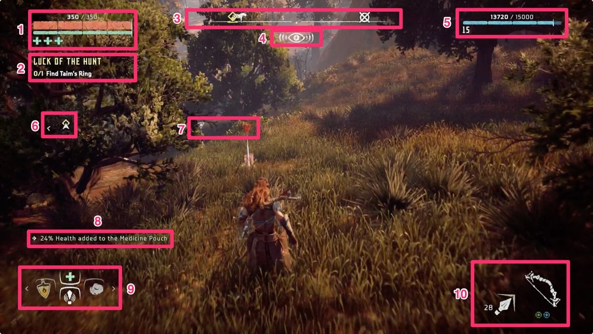
Source: https://www.polygon.com/horizon-zero-dawn-guide-walkthrough/21357225/beginners-hud-leveling-skills-buyweapons-inventory-items
Health and medicine pouch
Current quest
Compass
Stealth icon
Level and XP
Quest waypoint.
Resources.
Resource history.
Item shortcuts.
Weapon.

cognitive load
The key to crafting a great HUD is to understand your player’s mental state. As I talked about in another post, play personas can be a good way of thinking about players’ cognitive abilities at different parts of the game experience. An in-game HUD UI would generally fall under the fully leaned-in persona (Depending on the type of game) meaning the player has limited cognitive space for more information than what is necessary.
Designers should work to minimise what is on screen and focus on what is needed for the gameplay. This way of thinking about the HUD is a good starting point in developing a strategic direction for your design.
when designing a video game HUD
Do
1. Information Display: The HUD should display all relevant information to the player at any given time. This includes the player's health, score, ammo count, and any other important stats.
2. Minimalism: The HUD should be designed with minimalism in mind. Too much information on the screen can be overwhelming and distracting, so it's important to only include what's absolutely necessary.
3. Visual Clarity & Accessibility: AllHUD elements should be clear and easy to read. Player's shouldn't have to struggle to understand what they're looking at.
4. Functionality: The HUD should be designed in such a way that it doesn't get in the way of gameplay. It should be easy to access and use all HUD functions without disrupting the flow of the game.
5. Aesthetics consistency: The HUD should be aesthetically pleasing and match the overall art style of game
Don’t
1. Making it too cluttered – A HUD should be informative, but not so cluttered that it's difficult to understand or use. Players should be able to quickly find the information they need without being overwhelmed by too much data.
2. Hiding important information – All HUD elements should be clearly visible and easy to access. Information that is hidden or buried in menus can be easily missed by players, resulting in a frustrating experience.
3. Using confusing icons – Icons are a great way to communicate information quickly, but only if they are easily understood. Players should not have to guess what an icon means; if they do, it's likely that they will become frustrated and give up on the game.
4. Making it static – A HUD should be dynamic and change as the game progresses. This way, players always have the most relevant information at their disposal and can make better decisions as they play.
The Witcher 3
The Witcher series has been praised as one of the most influential games of recent times and has influenced games like Assassins Creed to change their formula and become more of an open-world RPG. For such a big and ambitious game as this, the HUD has to do a lot of heavy lifting and can quickly spiral out of control. Below are examples of people online trying to understand all the HUD elements. Which shows you how complicated things can get.
If your players need an external online resource such as this, then the HUD design is doing something wrong.

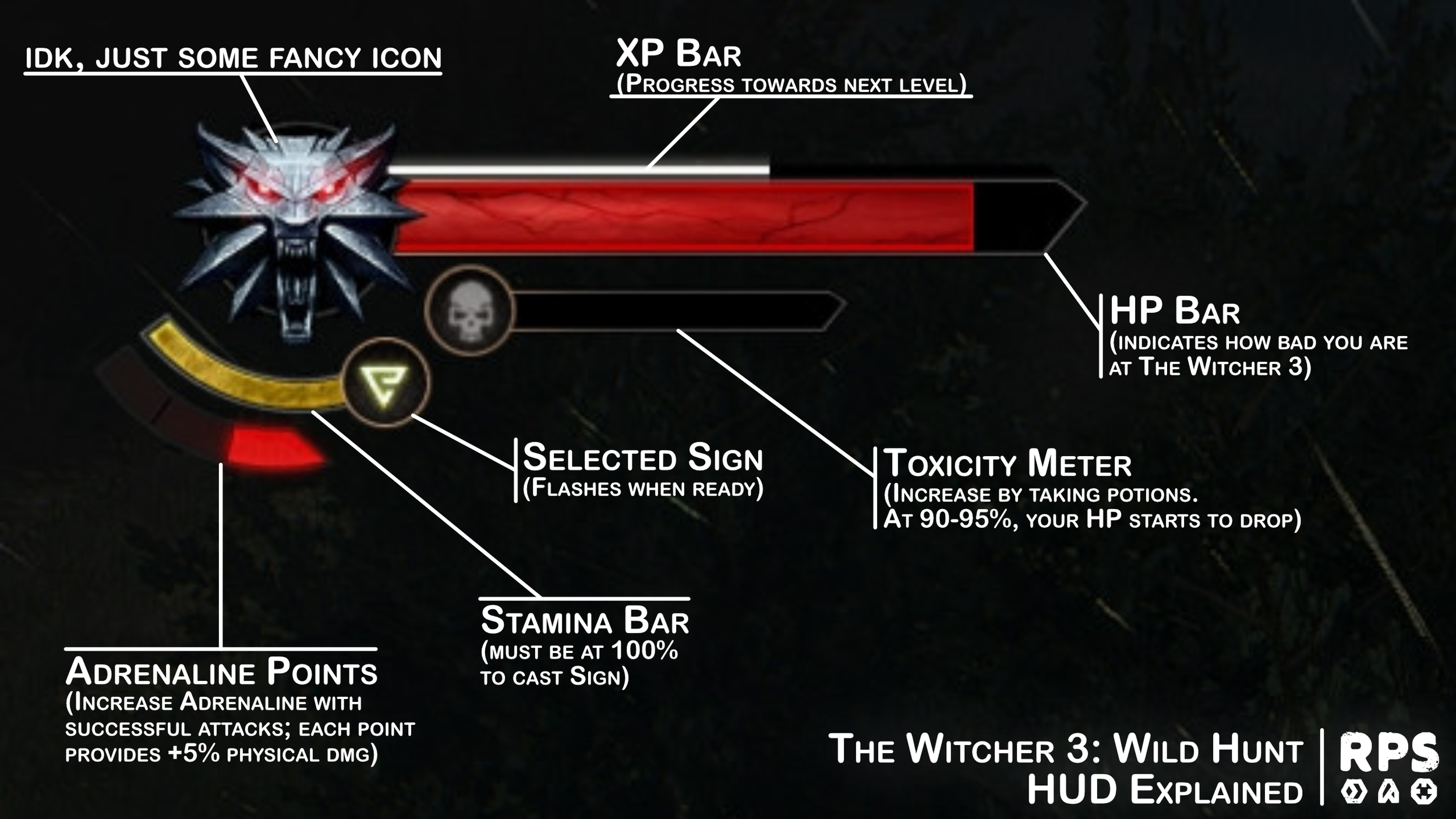
Trying to make sense of all this during gameplay whilst operating the controls can be very demanding. As well as the strain on players’ cognitive abilities, you will notice the amount that your eyes will travel which can be made worst if you are playing on a big-screen TV.
Source:
www.reddit.com/r/witcher/comments/352zxc/the_witcher_3s_hud_explained_oc/
https://www.rockpapershotgun.com/witcher-3-combat
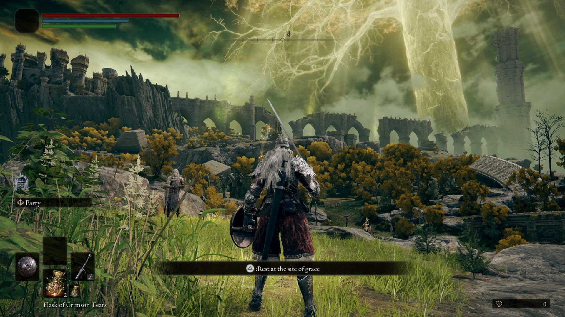
Elden Ring
There has been a meme going around on the internet called If Ubisoft developed Elden Ring. Seeing these fan-made mock-ups really shows next to the real in-game HUD show how cluttered modern games have become. This also illustrates players’ frustrations and sophisticated understanding of these different design approaches.
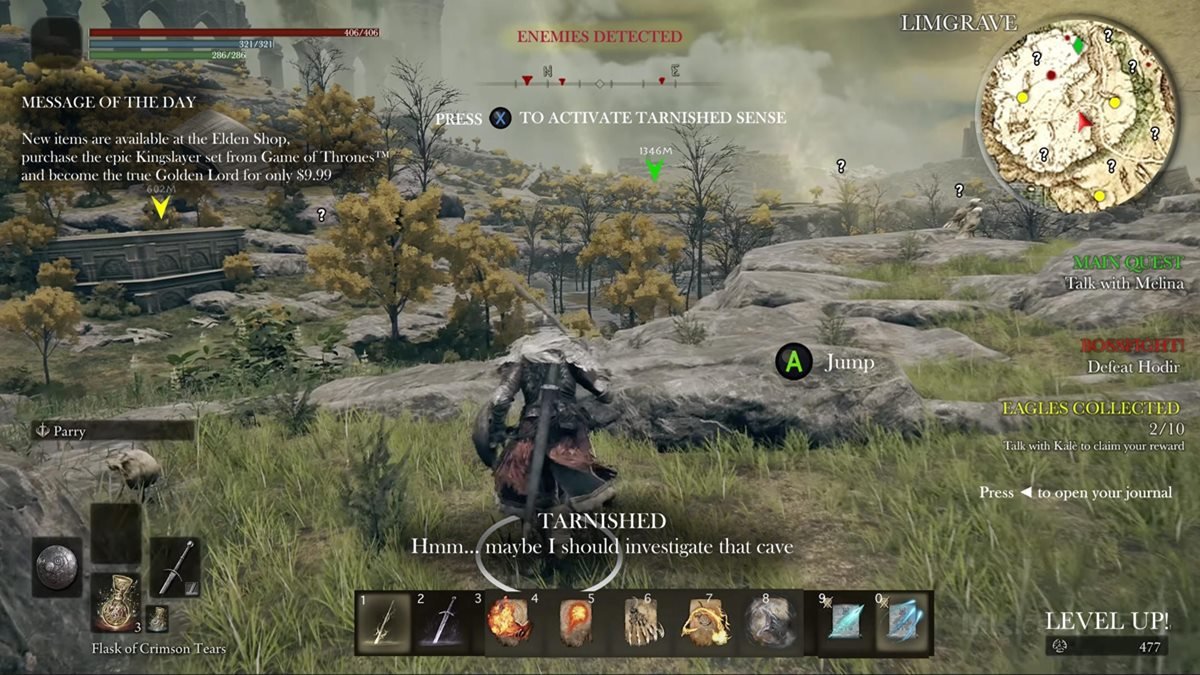
Source: https://www.reddit.com/r/Eldenring/comments/t7q55h/if_ubisoft_developed_elden_ring/

Elden Ring’s Custom map markers
Another great way of reducing the amount of info shown in the HUD is by giving the players autonomy in choosing their own markers. This encourages players to go fill in the map themselves by exploring and turns the map screen into a kind of mini-game similar to Neir Automata chip hud interactions detailed below. Make me wonder why other games don’t give you this level of interactivity with the map screen.
This approach helps those people who are both visual and kinesthetic learners as well as reduces cognitive load by allowing you to choose how many markets you want to have. But, players can place up to 100 markers on the map consisting of the following.
Sword
Skull
Person
Animal
Plant
Gem
Treasure
Flag
Tree
Tower
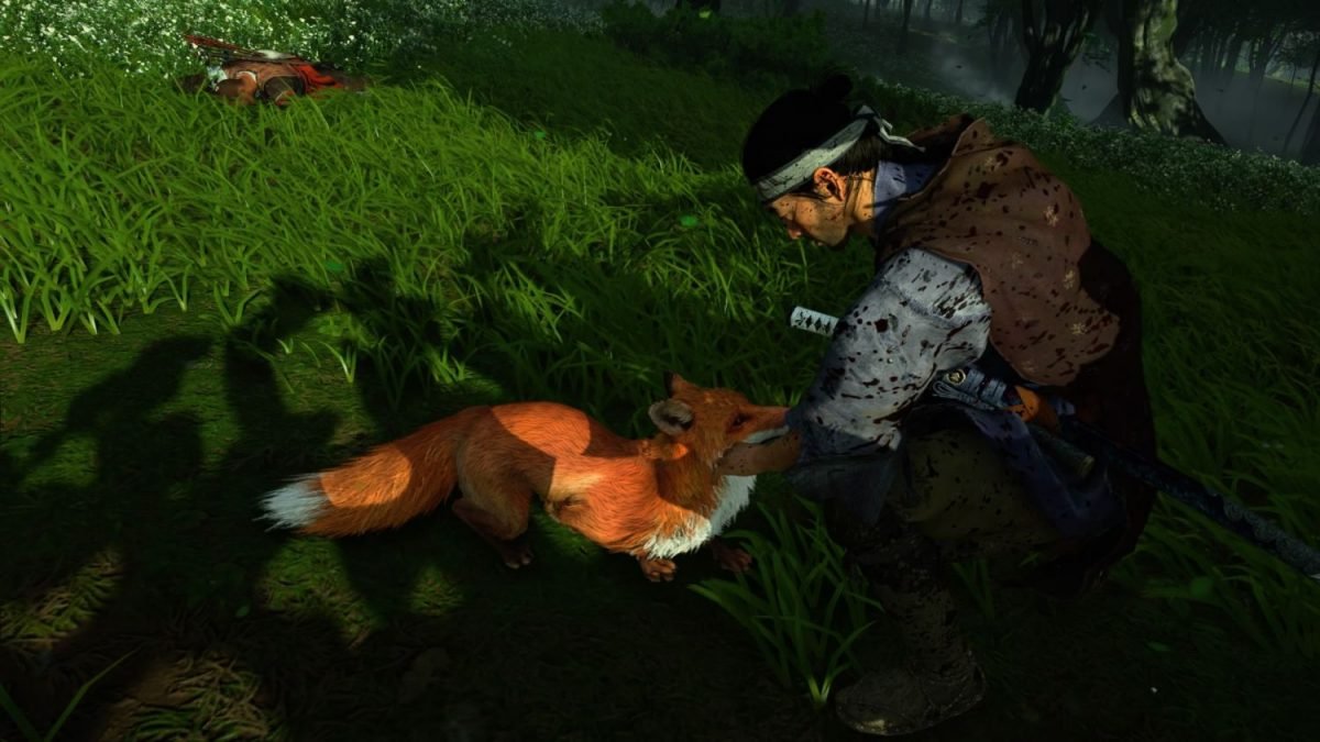
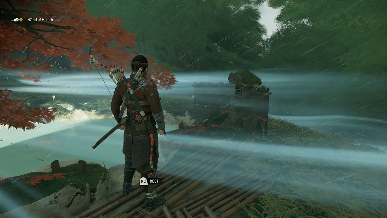
Ghost of Tsushima
Ghost of Tsushima has a smart contextually aware way of showing the HUD. You only see your health when you draw your sword. This is similar to how in Destiny 2 will only show your health bar taking damage. I hope we see more of this dynamic HUD strategy.
Returnal

Newer games do a better job at reducing and positioning their HUDs. Returnal is a recently new game that does a better job than most games at reducing the number of items in the HUD than most other games. It does this by moving almost everything down to the bottom. This also reduces eye travel. But there is also a reliance on icons and which is why some players are having to look up guides such as the one here.
Your current overall objective.
The mini-map. This excerpt from the area map shows your current position, with points of interest such as enemies (red), items (green), and obolites (yellow) indicated as arrows and plus signs.
Ether. If you die and start a new cycle, this rare ether currency remains with you. Spend it to purify chests and other objects, to activate a device that serves as a one-time checkpoint, or for limited other purposes.
Atropian keys. They unlock certain doorways and treasure chests. Sometimes you have to purify them first, or else risk a malfunction.
Obolites. Unlike ether, this currency is fairly common but doesn’t stay with you when a cycle ends. You mostly spend it at terminals for artifacts and consumable items, plus it sometimes facilitates stat boosts.
Alt-Fire. Indicates which variety of powerful alt-fire you will unleash with your currently equipped gun and offers additional direction if the shot is presently recharging.
Proficiency. It starts at 0 with each new cycle. Find calibrator items and defeat enemies to increase its level, which improves the quality of weapons dropped by defeated enemies or obtained from chests.
Integrity. This is your life meter. When it empties, you die.
Consumable items. Up to three slots display. Use the one currently highlighted by pressing L1, or switch between them with the D-pad if more than one is available.
Adrenaline. For every three enemies you defeat, you’ll gain one level of adrenaline. Each time you raise this counter, you’ll gain a new buff. These stat boosts disappear the moment you take a hit.
Source: https://www.polygon.com/returnal-guide/22421162/hud-elements-explainer
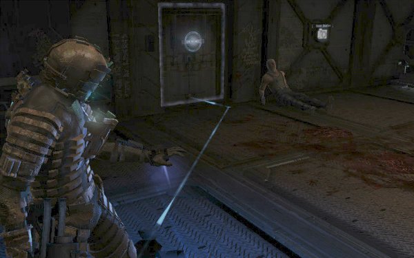
Dead space
When it comes to third-person HUD UI we have to talk about the elephant in the room which is Dead Space. What are some things we can learn from it? Here is an interesting video that breaks down the design philosophy and exclusion.
Metroid Prime


Metroid Prime which came out in 2002 is a good example of a game that uses the HUD as part of its diegetic inworld design. It is literally the HUD your characters helmet display. Similar to the same way the HUD is shown in the Iornman Movies. This works well as it is designed to be a first person shooter. Games like Returnal that are third person shooter with horror elements maybe could have used a similar approach the Dead Space. Any opportunity to incorporate your HUD design into the world or narrative helps immersion. But maybe not be suitable for all games.
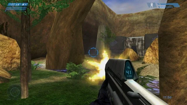
One of the best early example of a diegetic HUD in a FPS was Halo. By putting your ammo counter on the guns themselves it took away the need for another HUD element because you could just look at one place to see what gun you are using as well as the ammo .

Another great example of a diegetic UI is Metro Exodus. Metro takes this idea further by having your radiation meter and your compuse on your characters hands as well as the ammo counter on your gun.
HUD as gameplay: Nier Automata
Neir Automata has gone further than just having a customizable HUD, or a dynamic HUD or even incorporating to the narrativly driven HUD. It has one of the best implementations of a HUD design that I have seen with its Chips feature. The core premise is that the game UI screens are actually part of your character (Who is an android) operating system. This helps to extend the game's themes and build on the game design aesthetics.
In the Nier Automata, you explore the world and pick up Chips which can be HUD elements that you equip on to your character like you would a piece of armour. Turning your HUD layout into a interactive gameplay element. You can quip the right piece of HUD element for the right situation or the right enemy. This is also a great way of giving the player a new level or agency over their HUD.

Chips are passive skills that can increase some of your character's stats as well as adding new automatic passive abilities, for example taking damage. These benefits come from chips that are currently installed, where as all your other chips are kept in the inventory and remain inactive. You are aloud to freely install and remove your chips as you want as long as its within the storage limit. This limit can be increased. This turns your HUD management into a mini-game and incentives you to go out into the world and find these Chips.
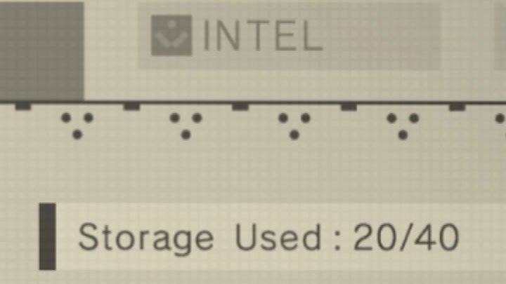
Storage
To avoid players just equipping everything the in-game OS has a limited storage capacity which you cannot exceed. The Information about your storage that is currently in use and the maximum storage is displayed in the upper right corner of the screen.

inventory
The chip equipping screen shows an inventory box where these chips are plugged in and are shown as coloured stripes. Each Chip takes up a different amount of vertical space so you have to pick and choose exactly the Chips you think you might need, and some of them are quite vital. Everything from attack power, passive abilities to combo limits.
Source:
https://www.platinumgames.com/official-blog/article/9624
https://guides.gamepressure.com/nier-automata/guide.asp?ID=60047
https://nier.fandom.com/wiki/Plug-in_Chips#Chip_types
Quests and mission info
The common way for games to display missions and quests is to have some kind of text reminder on the screen. A non-diegetic floating UI that is always visible whilst the question is being tracked. Kinda like a sticky note stuck to your screen. This is an OK solution but there can be more immersive ways to do this.
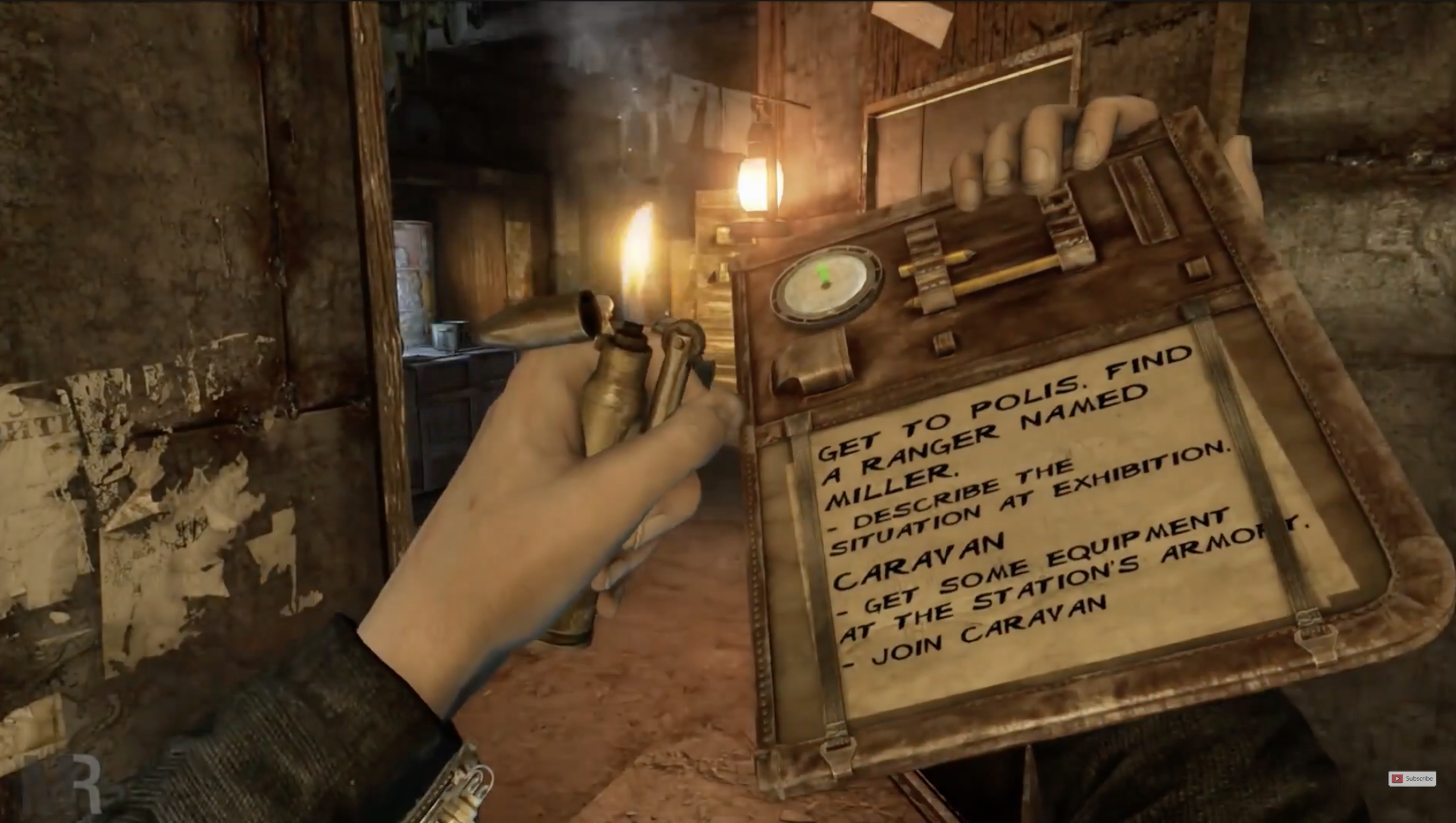
Metro 2033 similar to Ferry 2 and Frewatch uses a full diabetic UI in its maps and ammo counters. But it also has a in world solution for showing the player quest and mission objectives. Your character literally pulls out a to-do list. A innovative solution as you don’t need to see it all the time and it is inline with the immersive UI strategy of the whole game.

On the other scale of things are Deathloop and Splinter Cell Conviction, which show the players large floating in-world text reminders of the current mission objectives.

The Motion Tracker tool from Alien: Isolation is another great example of diegetic mini-map alternative https://avp.fandom.com/wiki/Motion_Tracker_(Arious)
Waypoints and route markers
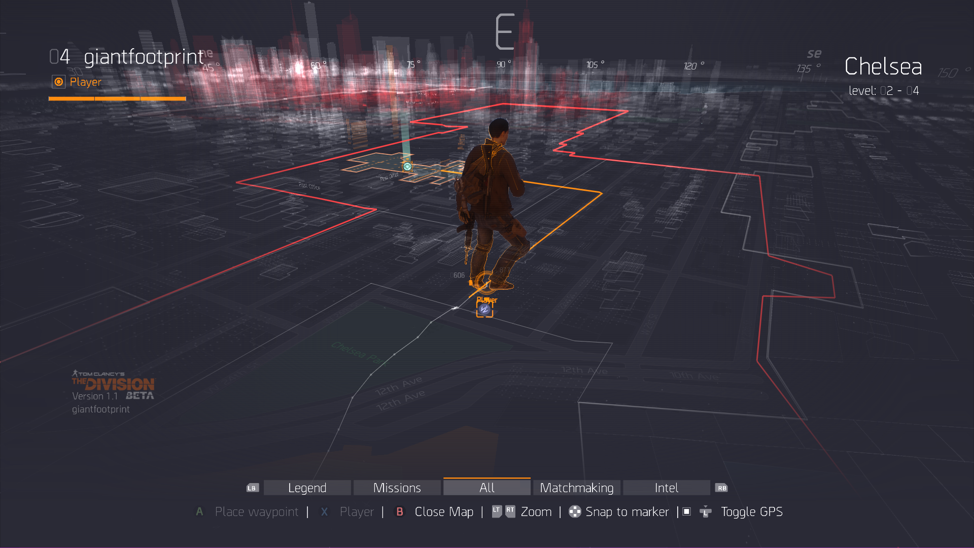
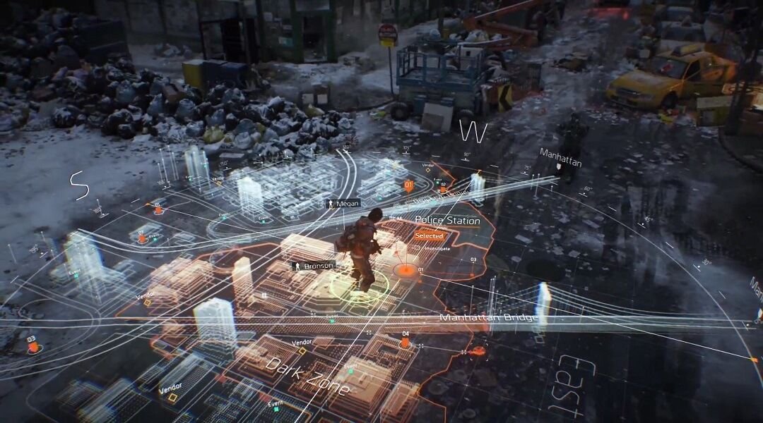
Many games have some UI to give players a clear sense of location and mark out the route they need to follow. Some users are kinaesthetic learners and like to find their way by travelling and some players are visual learners and love to market out routes on a map and almost everyone is some combination of those. There are some alternatives to the standard ways of marketing waypoints and routes to players. Even The Division shown above tried to come up with some innovative perspectives.
Non-diegetic waypoints.
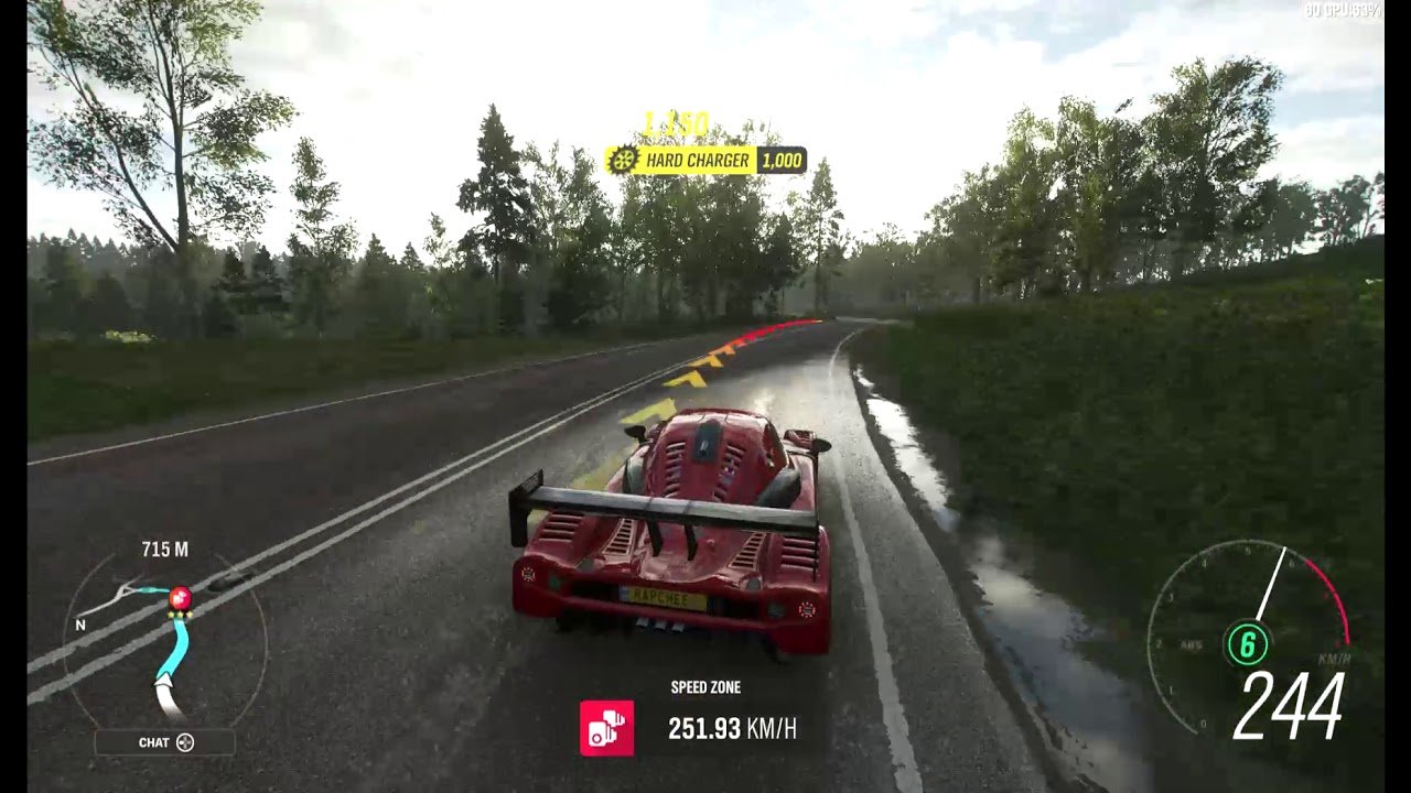
In racing games like Forza Horizon, the navigation routes are shown on the road itself. This is usually updated if the player misses a turn.
Note: In racing game the HUD changes if the camera view is inside or outside the car.
Diegetic way
Similarly but in a fully diegetic way Headspace also marks out the rout to your desired location. A holographic been of light it marked out on the floor for you to follow.
Environmental waypoints
Ghost of Tsushima uses the elements in the environment to guide its players. The wind and red foxes are shown to the player as ways of driving them to locations without the need for floating non-diegetic UI.
CONCLUSION
The HUD should not just be thought of as a simple way of showing game status but can be a strategic decision that can complement and improve the game design itself. There are many ways of designing a great HUD and hopefully, some of these examples can be a learning point for what strategy you want to develop for your game. There is no magic bullet or solution as games are too vast in nature. But as UX within the industry matures we will see better use of screen real-estate.